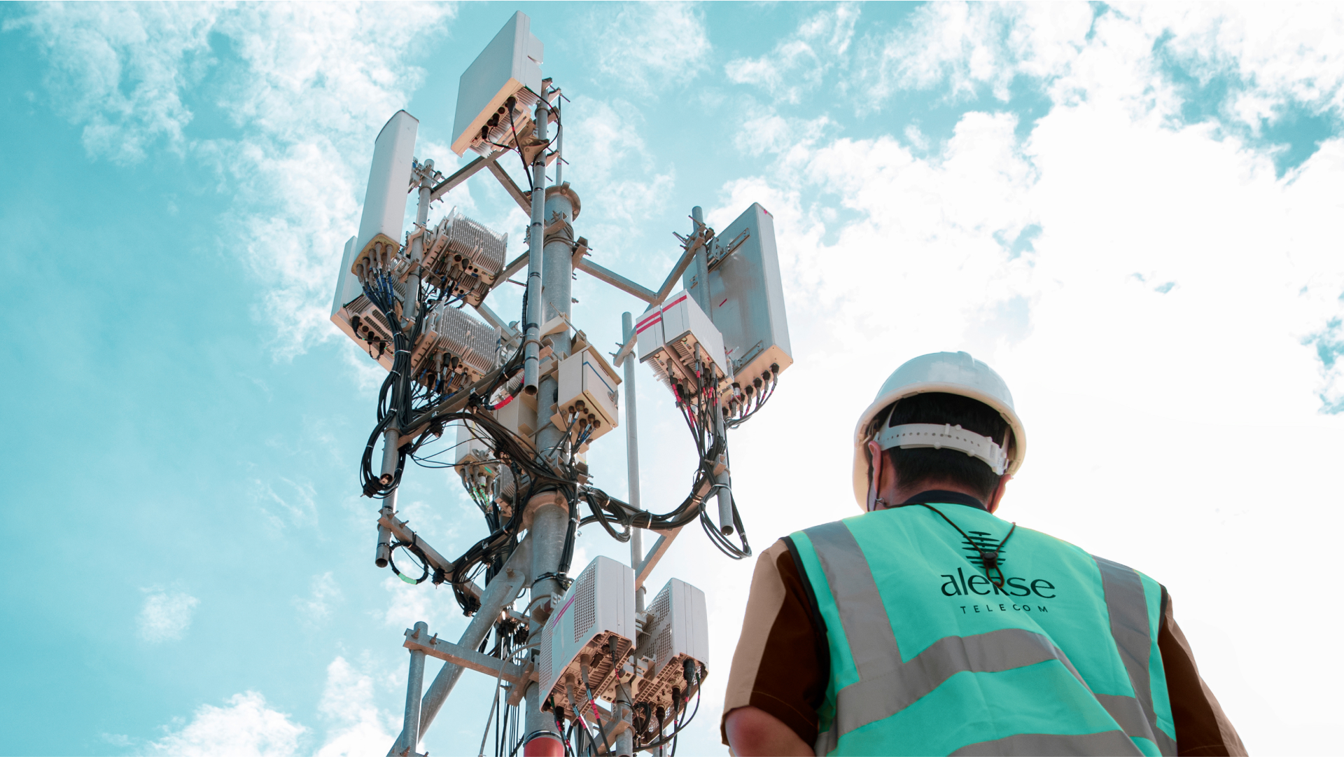
Alerse
When a client with over 20 years of experience contacts me to revamp their company's image, I hesitated to suggest a name change, as the previous name followed a common initial letter pattern used when starting a business. If it was time for the company to invest in a new visual identity, why not also change the name to reflect this new phase?
service
Visual identity
year
2023
sector
Telecom, internet

Naming
In our discussions, we came to the understanding that it would be a coherent investment to reflect the company's new phase.
The idea was to translate the company's history along with a mission to continue and leave a legacy, because Ricardo, the owner, followed the career path his father instructed him in.
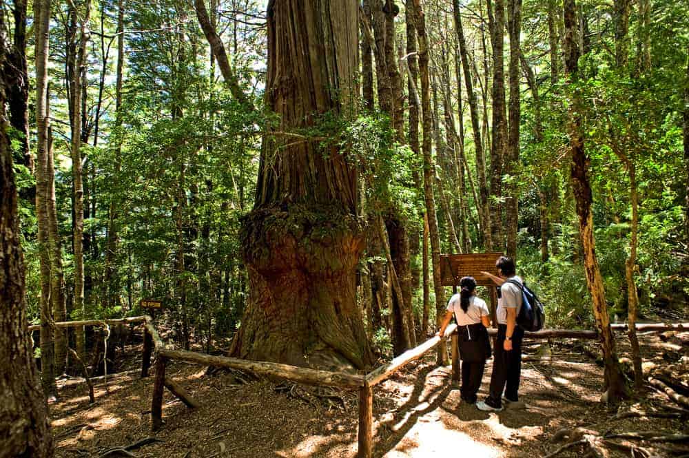
Four concepts emerged from the immersion. We followed the narrative that trees are the oldest communication towers known to humankind, where birds build their nests and raise their young, and their songs echo through the forest canopy. And one of the oldest trees is the... Fitzroya cupressoides or alerce-from-patagónia.
This name, in addition to supporting the company's commitment to promoting real relationships through telecommunications, also relates to the company's actions in environmental preservation measures through the reduction and use of ecologically sustainable materials.
To close with a flourish, we honor the name that brought them to this point, RS Consult, by making the Ale change.rce for Alerse.
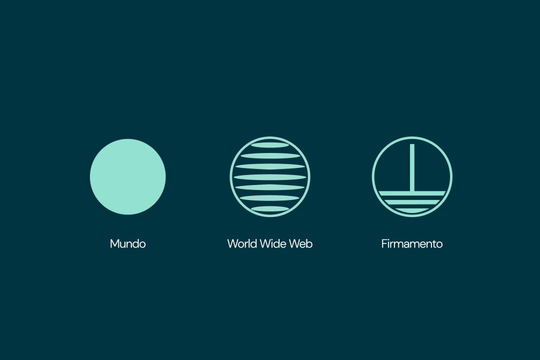
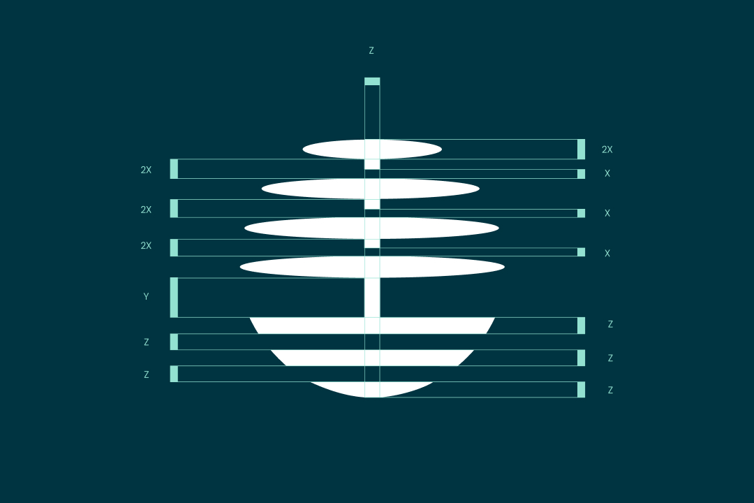
Concept
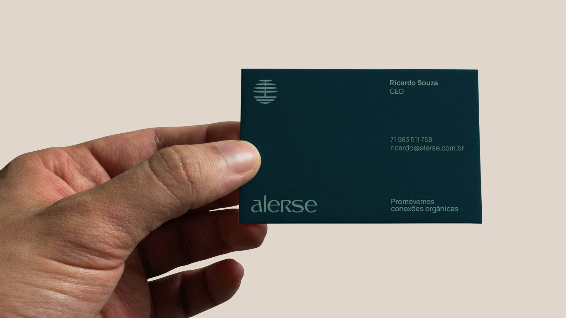
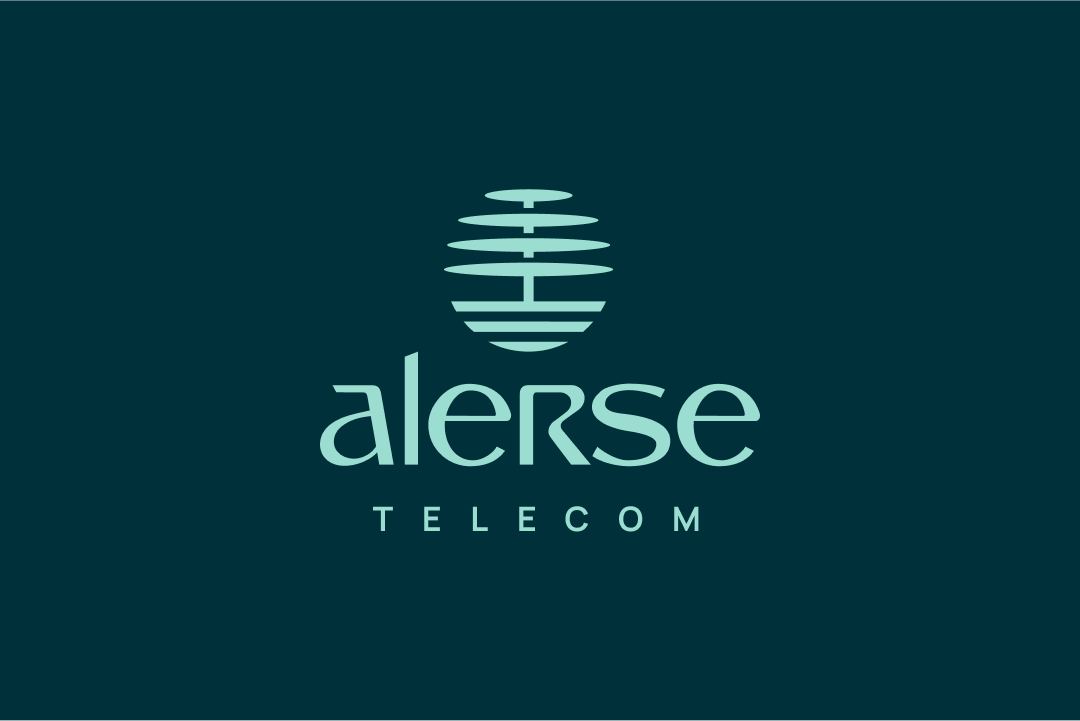
The keywords defined for the project were: modern, elegant, and different. In the mood board phase, we found the visual concepts we wanted. The symbol has a direct connection to the tree (natural relationships), globalism (telecommunications), and also grounding (the website construction process). I arrived at this symbol, which has the potential to be timeless.
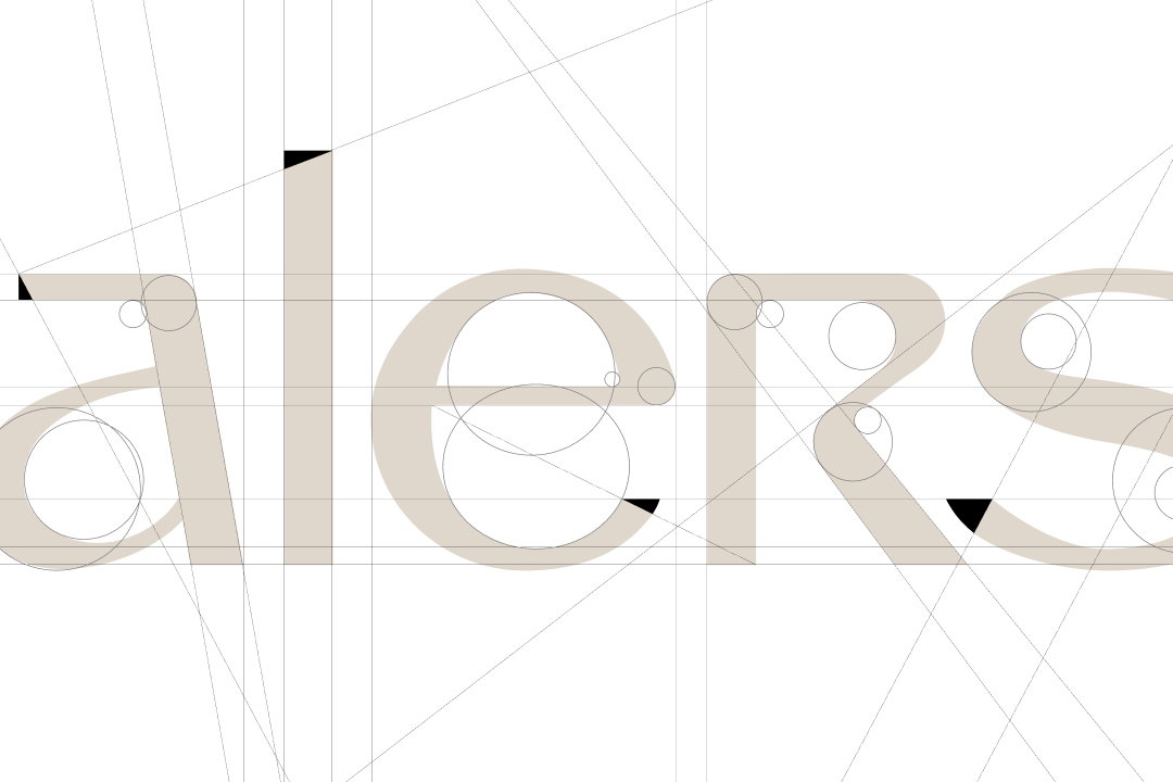
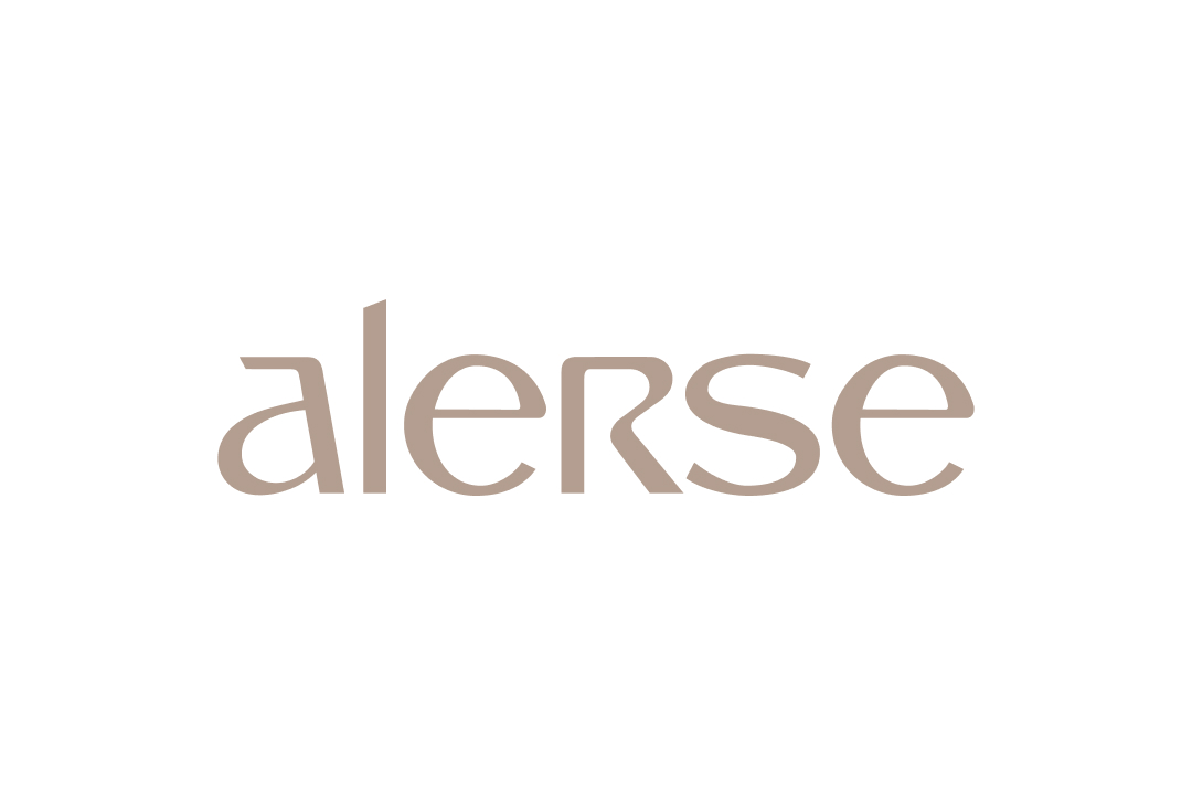
Signature
I've always wanted to design a typographic logo, and this was the perfect opportunity.
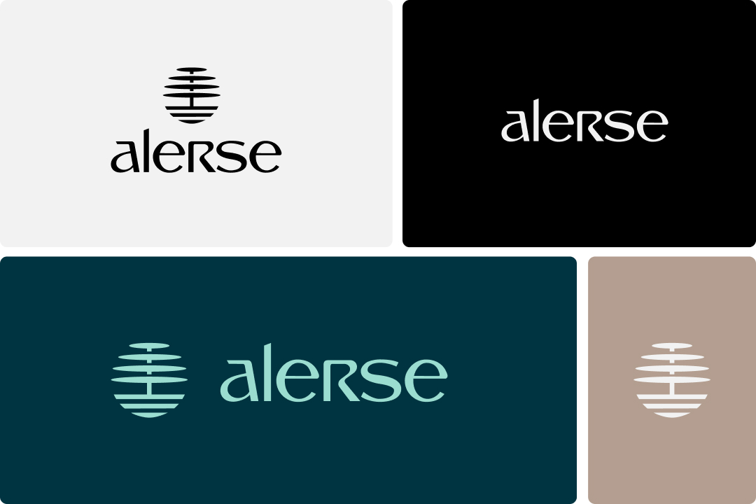
The beauty of the curves and cuts represents seriousness. The lowercase letter "a" conveys a sense of closeness. And last but not least, honoring once again the legacy of RS CONSULT, we have RS highlighted in uppercase to sign this brand with elegance and personality.
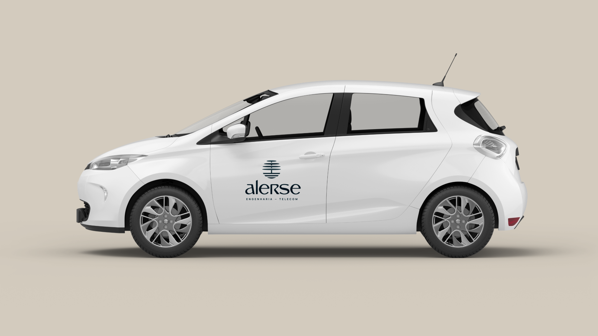
Colors and versions
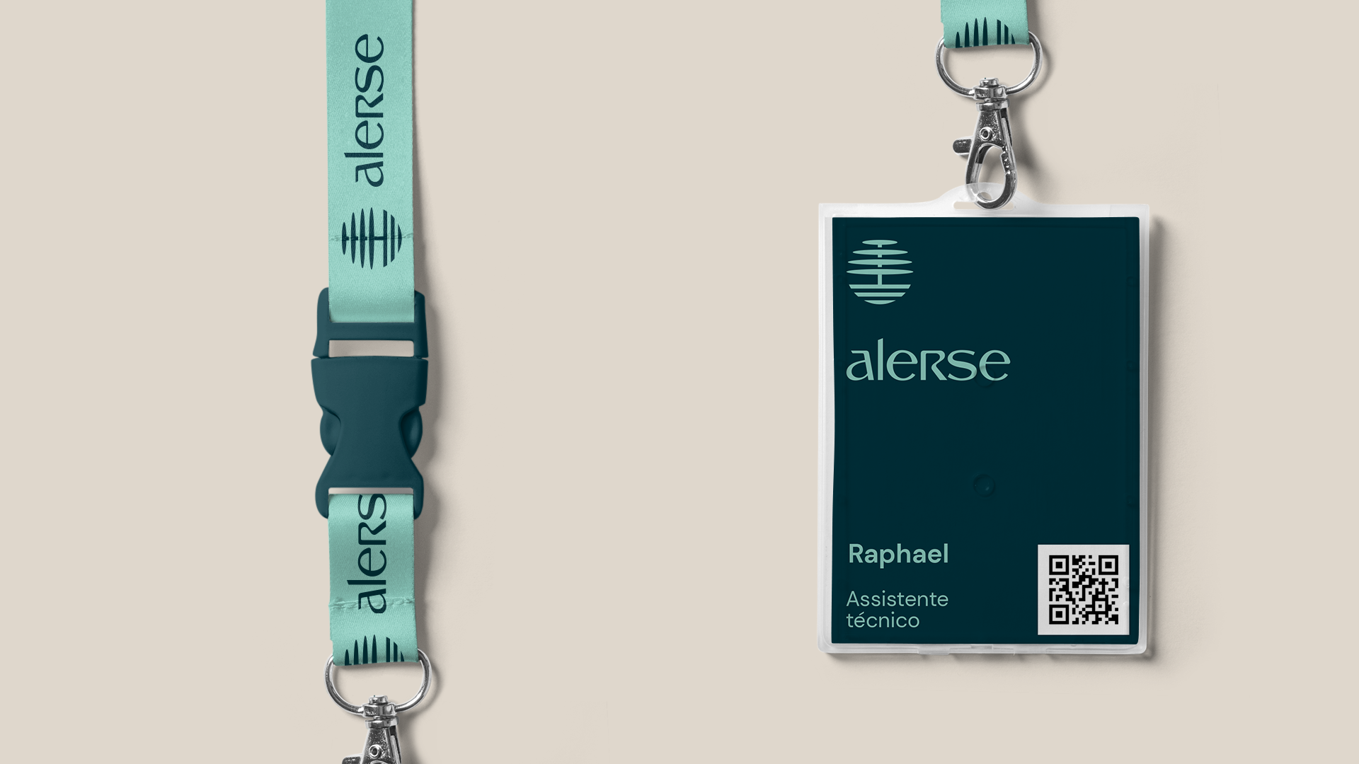
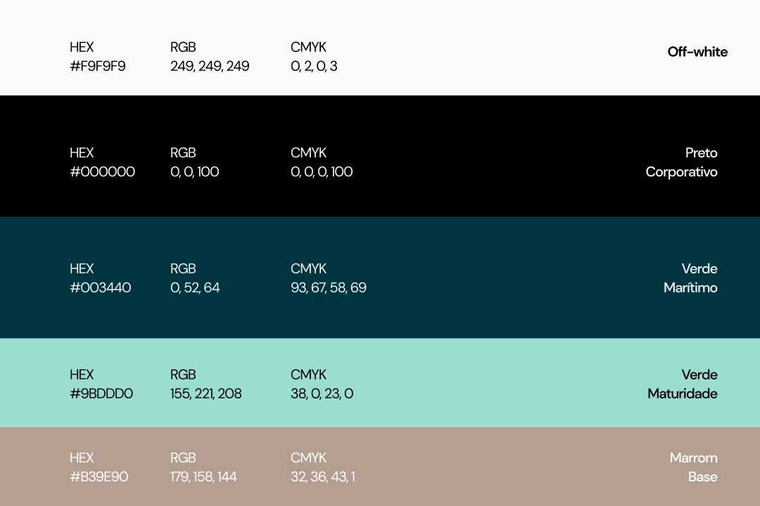
Still aiming to communicate legacy, it brought in the color green for maturity, with this desaturated shade of green, representing market experience.
Sea green, to pair with black, is what we bring into the palette as part of a desire for renewal.
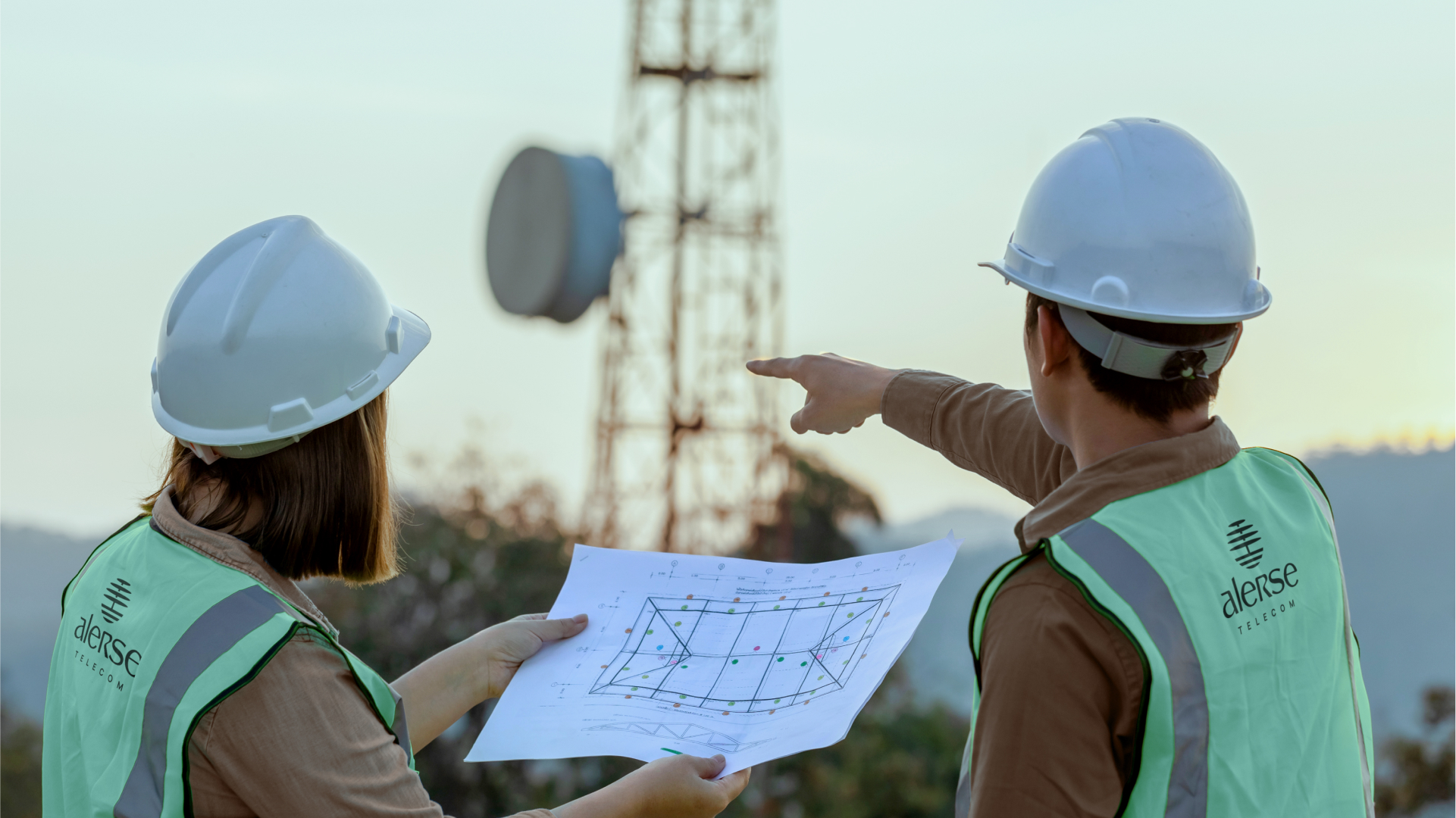
And the base brown color complements the field workers, where they secure the sites and installations.
