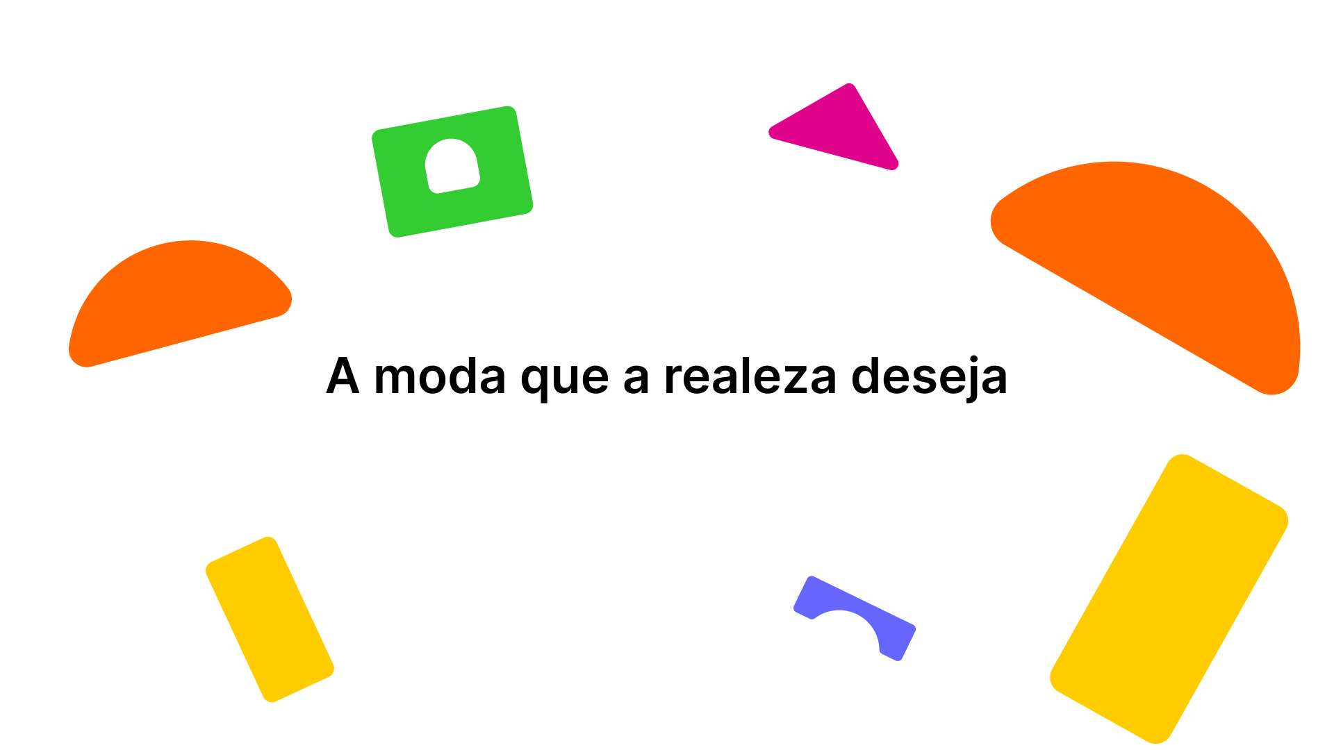
This project speaks to the feeling of valuing childhood, the purity of simple things, and the appreciation of high-quality materials, to the point of being "fit for royalty."
The central goal of this project was to move beyond the superficiality of local stores competing on price; we brought to this online store a narrative of treating children like royalty.
Ultimately, we want our princes and princesses to be more than just beautiful.
service
Visual identity
year
2020
sector
Children's fashion, online store.
Concept
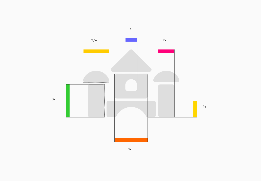
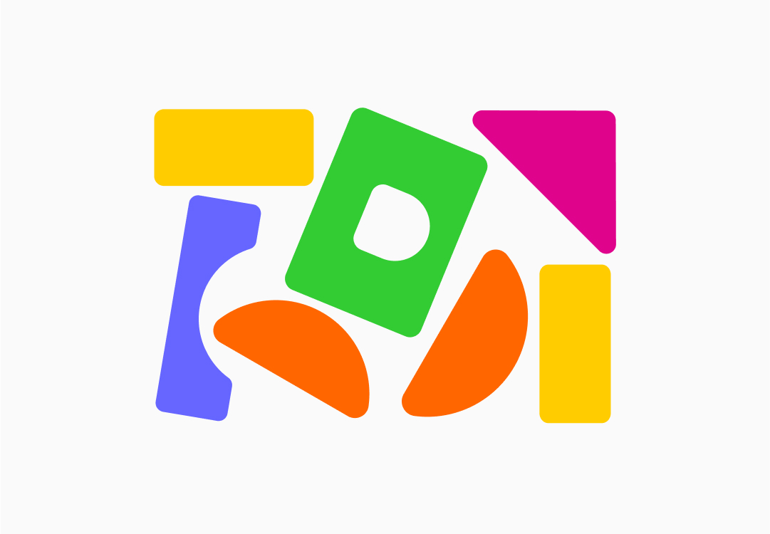
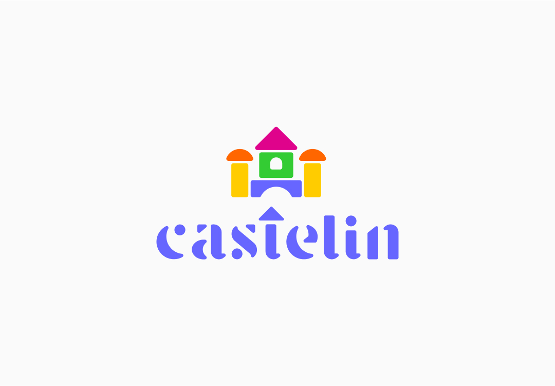
I revived a toy that predates the famous Lego, where you built "structures" with pieces. Then I structured it in a way that its proportions would be pleasing to the eye, and then I explored various colors that would visually combine well, representing the diversity that children's and youth fashion brings.
Signature
For our children, nothing sharp; the shapes were intentionally designed to have rounded forms to make it appealing, and with their separate shapes, they still evoke the assembly of pieces, like a classic toy.
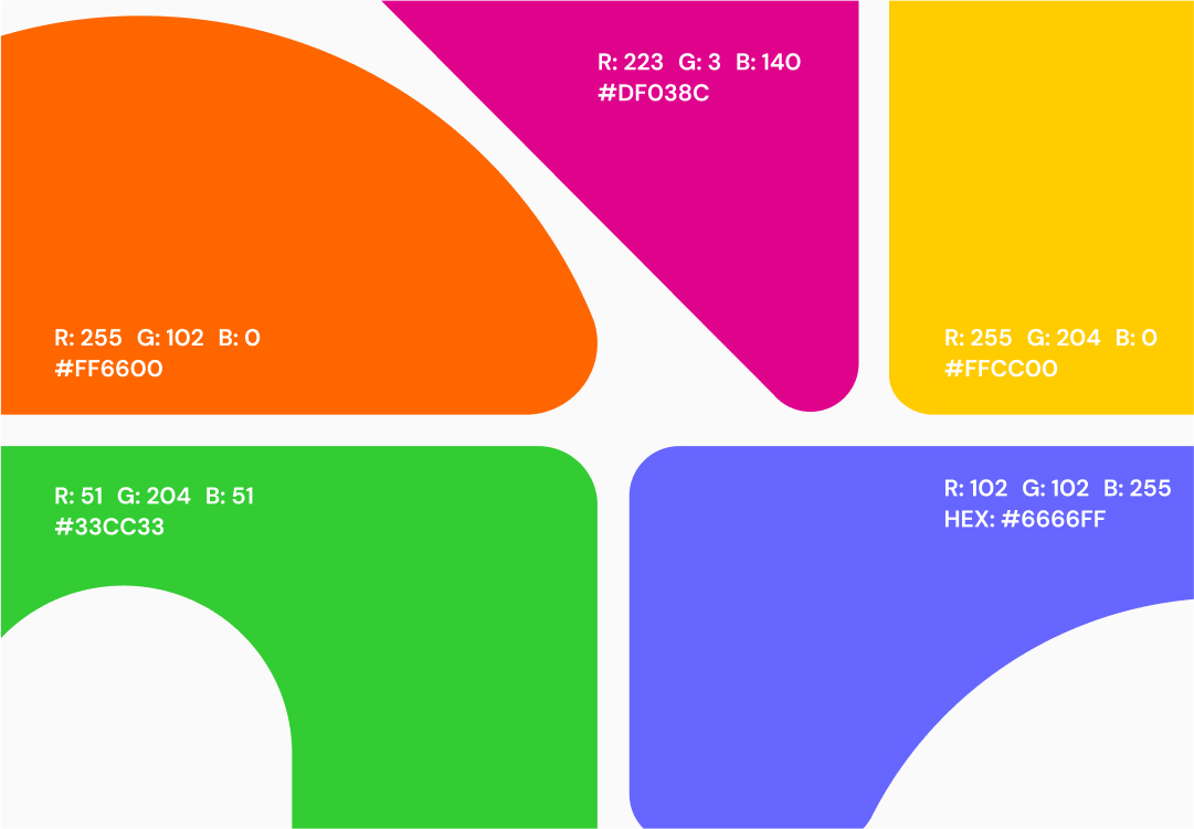
Colors and versions
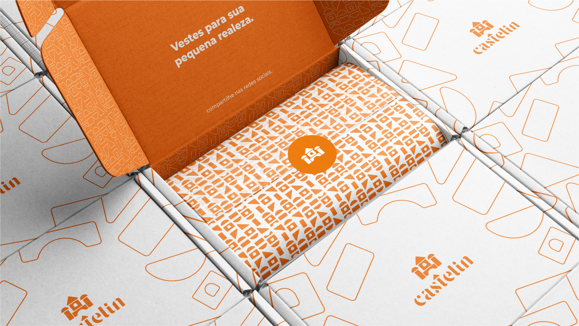
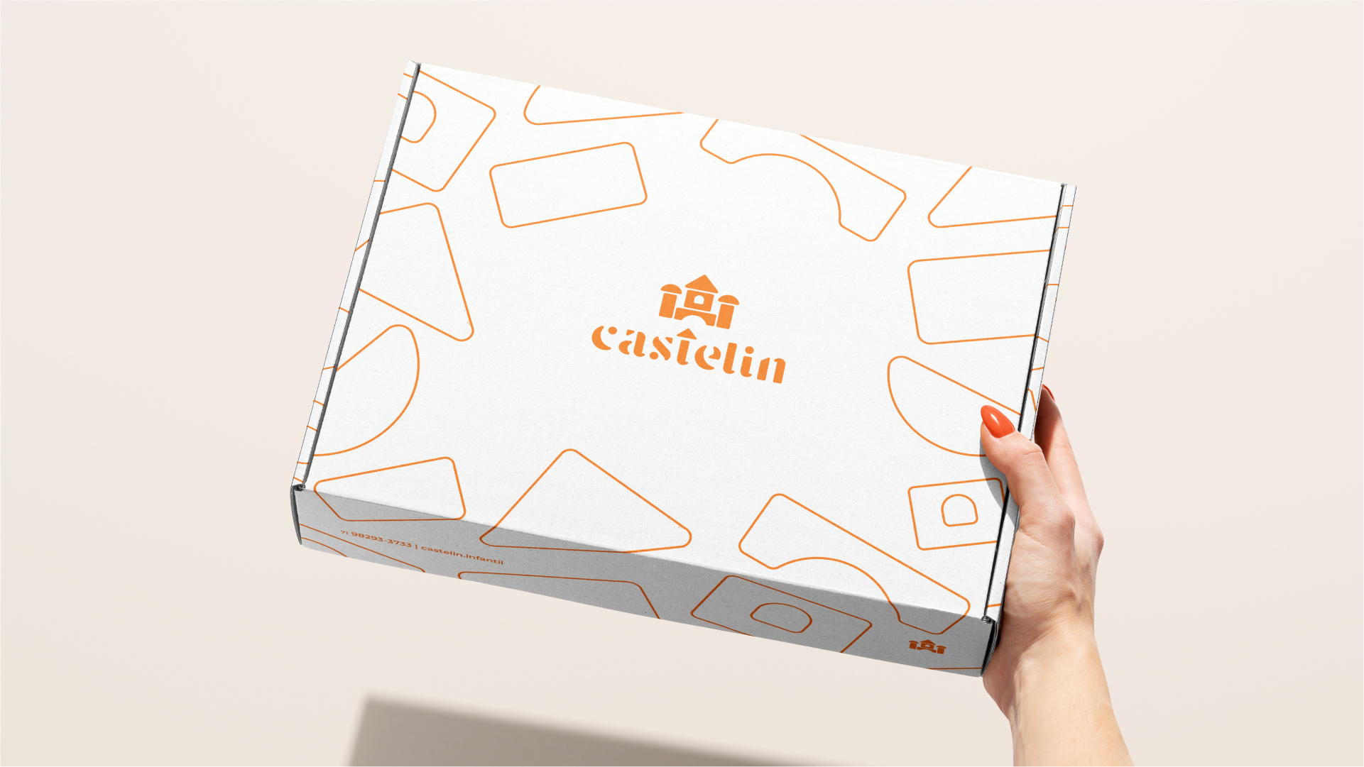
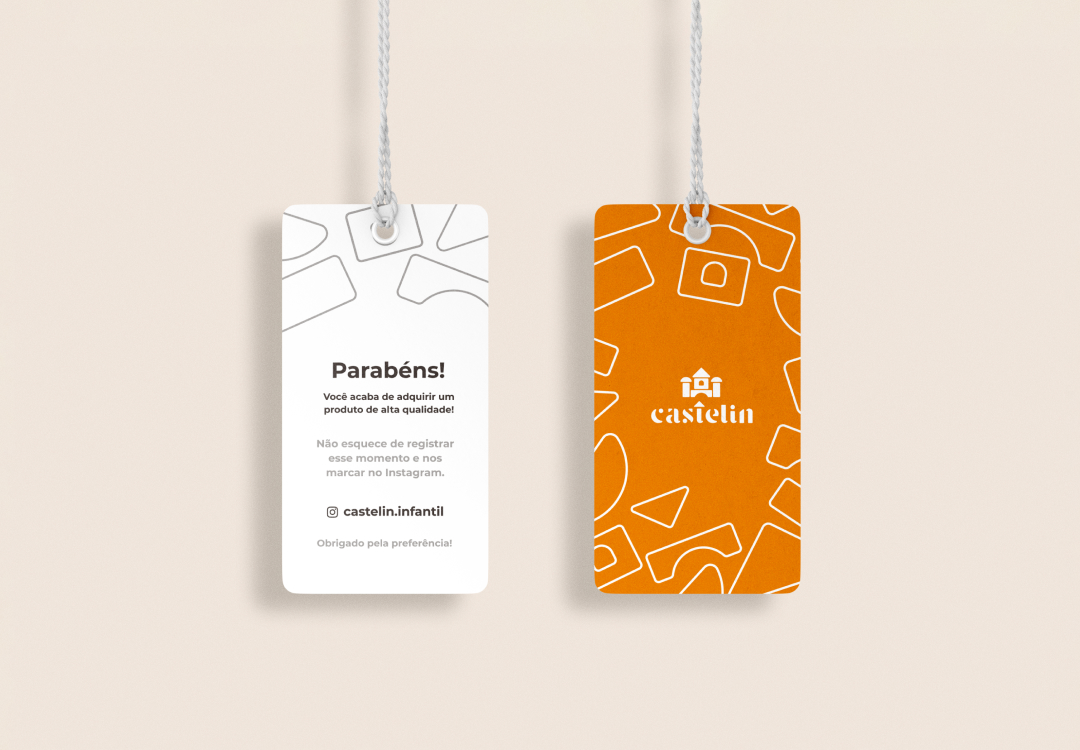
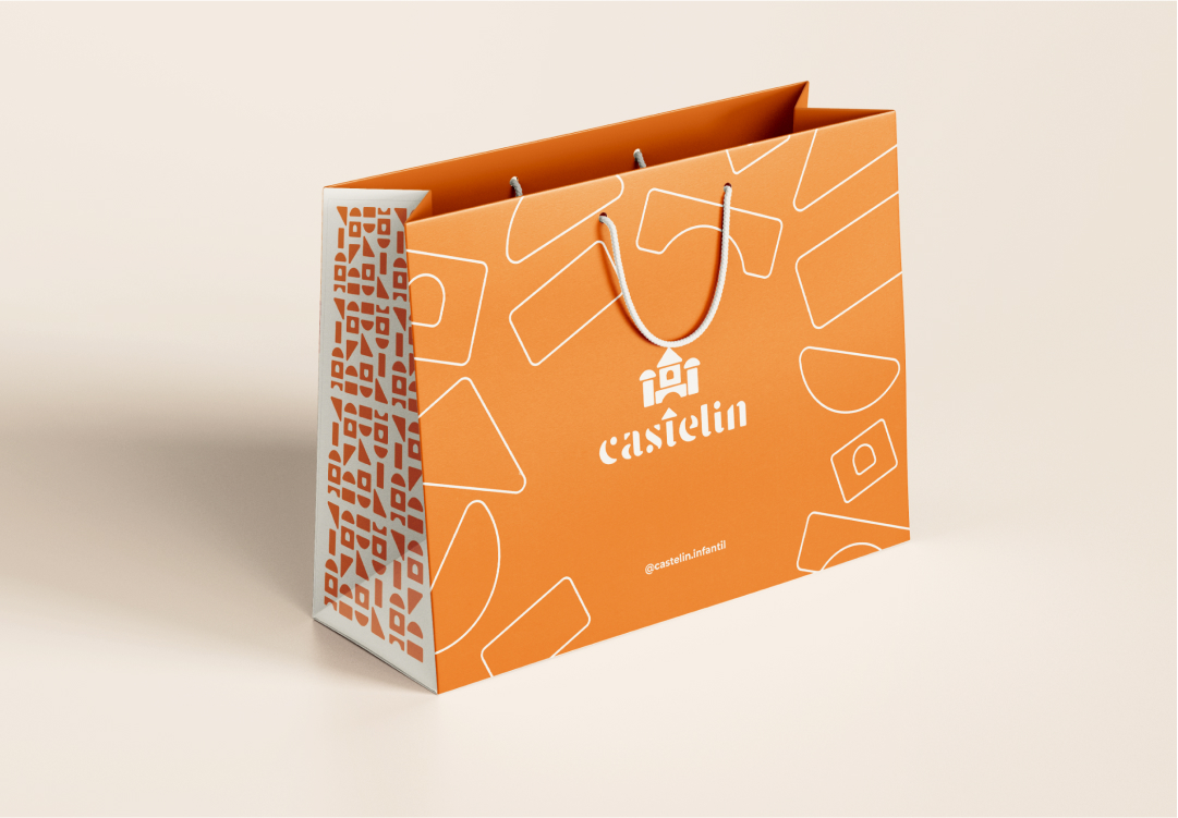
In digital communication, we use a variety of colors, both in publications and in internal media items. In printing, to reduce costs, we chose vibrant orange to appeal to both audiences (princes and princesses).