Caíque Ornelas is a physical education professional who works in a... Comprehensive in the fitness sector, whether for rehabilitation, body development for hypertrophy, or sports. Working with a primary niche of special groups, such as: obesity, hypertension, diabetes, among others.
service
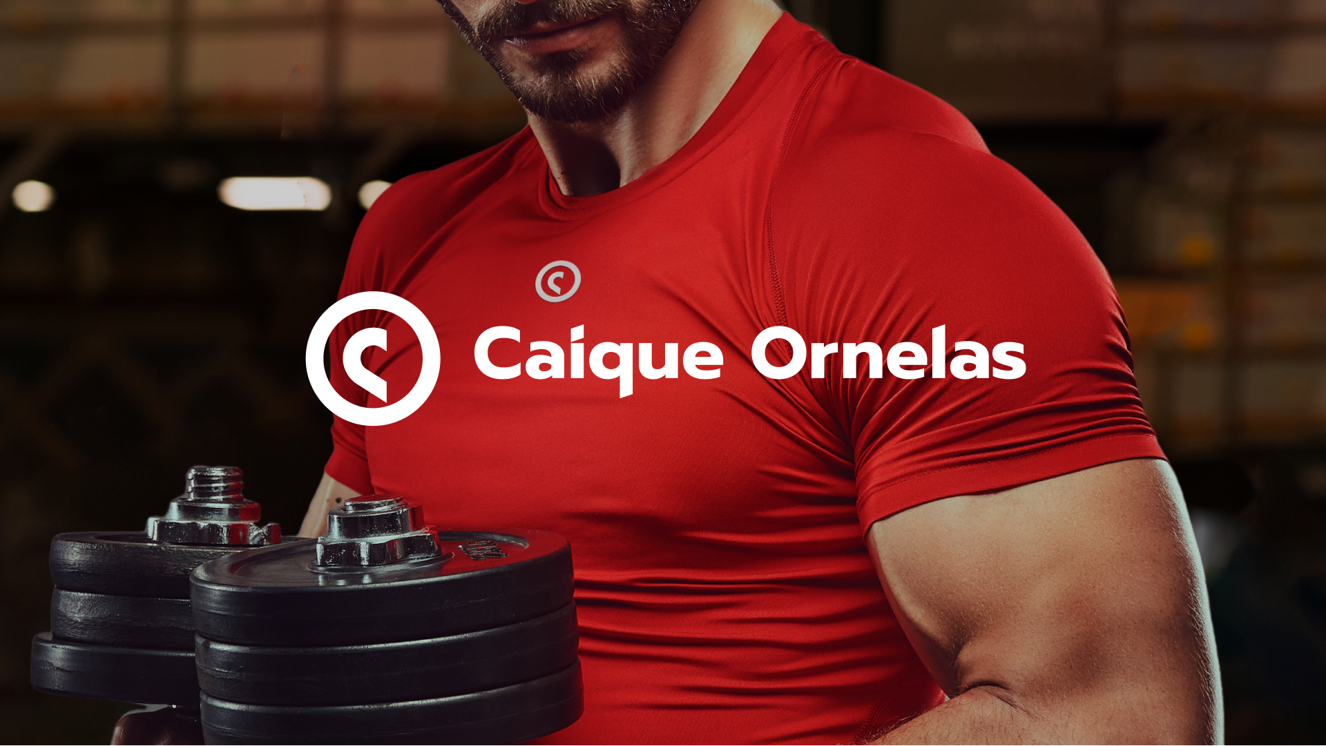
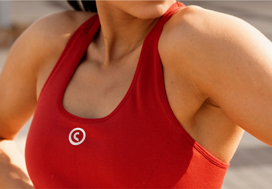
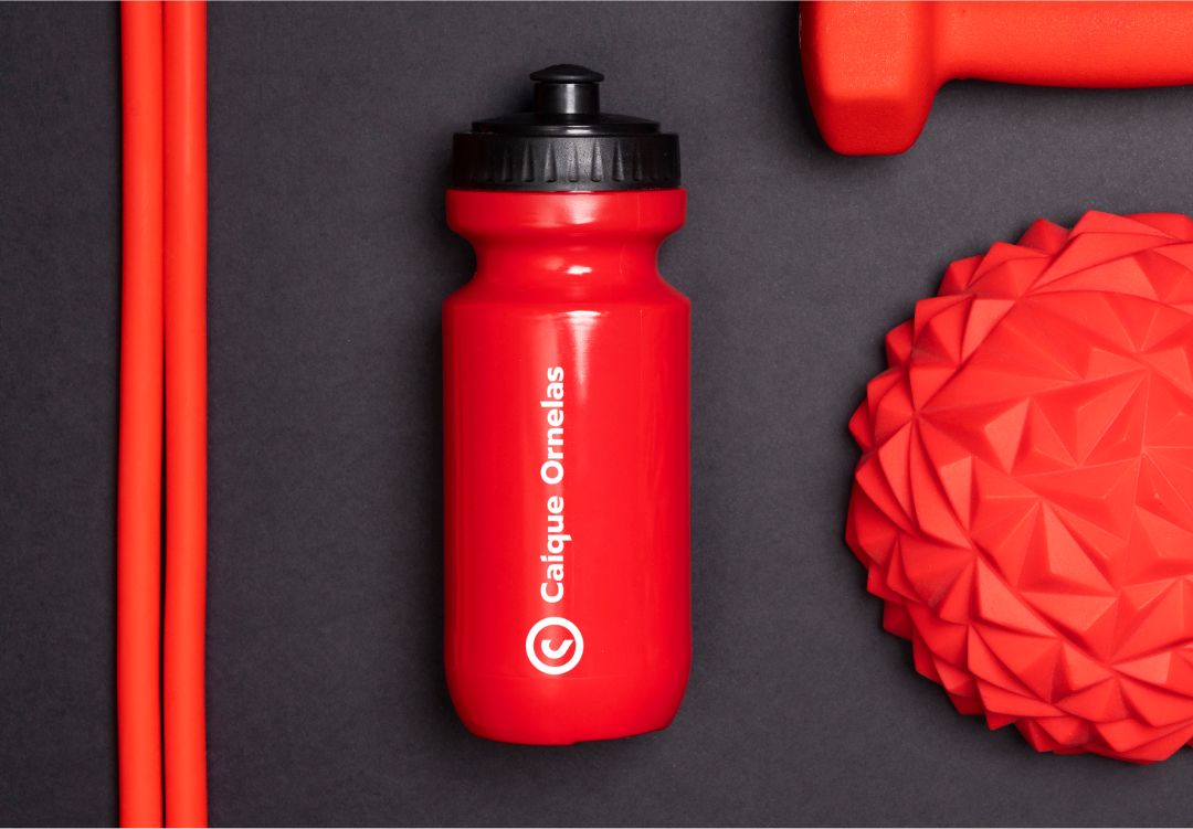
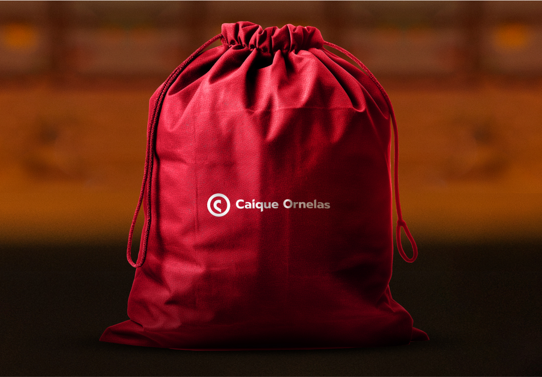
Logo
year
2020
sector
Coach, physique, health.
The idea
With forward-thinking ideas, Caíque aims to create a compelling persona focused on healthy living and earn the title of 'Heart Coach'.
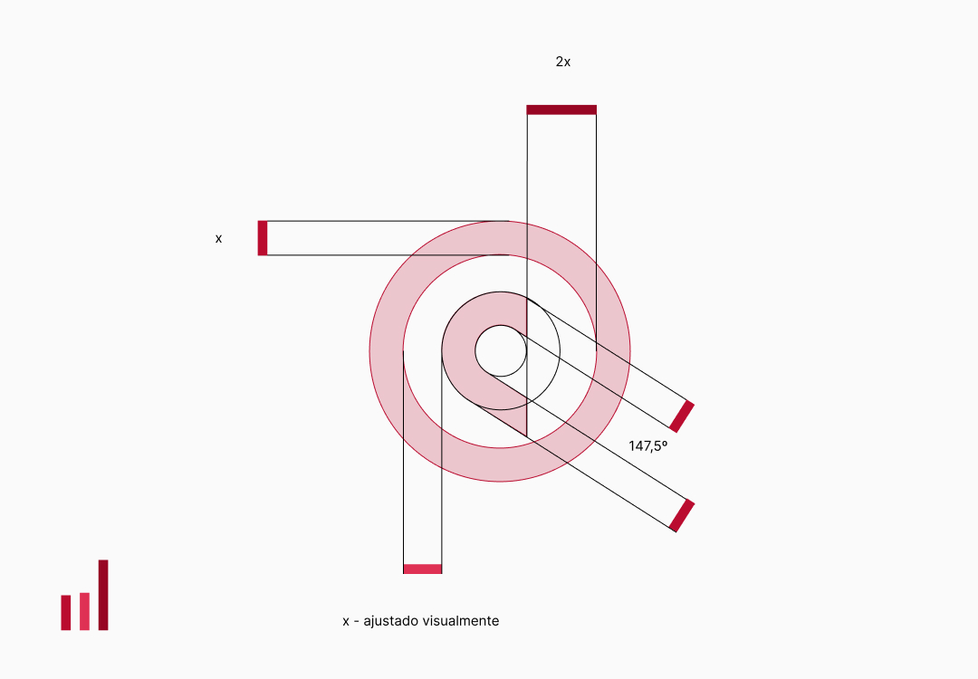
I've taken as my goal working on the concept of a heart-centered coach. However, the heart is not a very commonly used symbol in this field. So, I noticed that the strokes that form the letter C can give the idea of a heart, even if only partially.
The letter O in Ornelas carries with it a form that conveys the idea of completeness, of resolution.
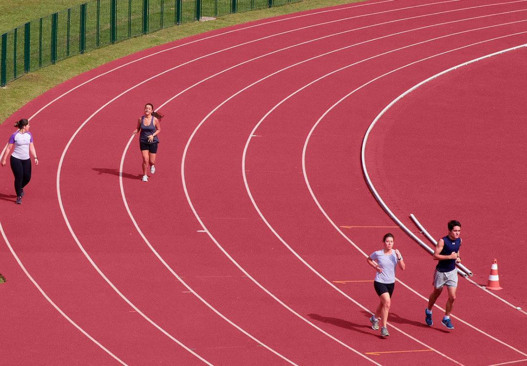
To make it something related to performance, I used the shape of an athletic running track.
Signature
In the signature, I used the font from the brand's typography and adjusted the crop angle upwards to represent evolution, improvement, and the expected attributes when body care is taken seriously, a task demanded with great love by Caíque.
Colors and typography
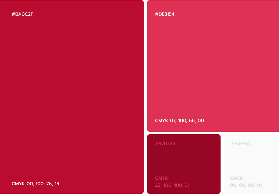
Since the heart is associated with red, the appropriate color to use would be red, however the darker shade I used refers to the professional, the seriousness, and the connection with blood, representing commitment to life.
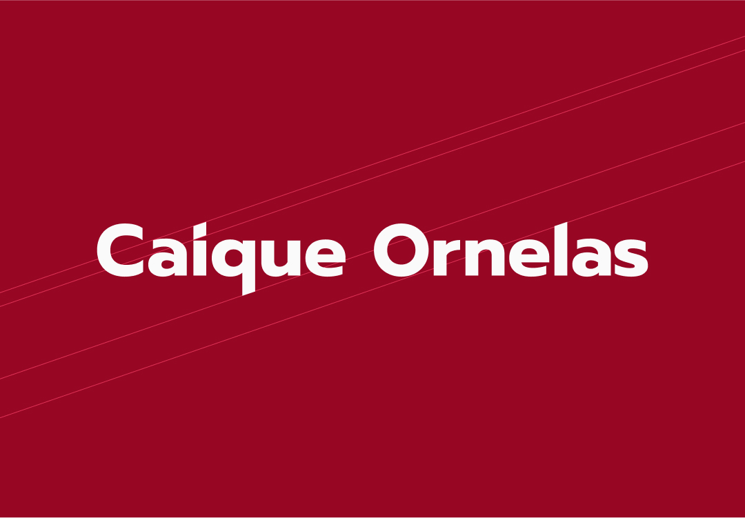
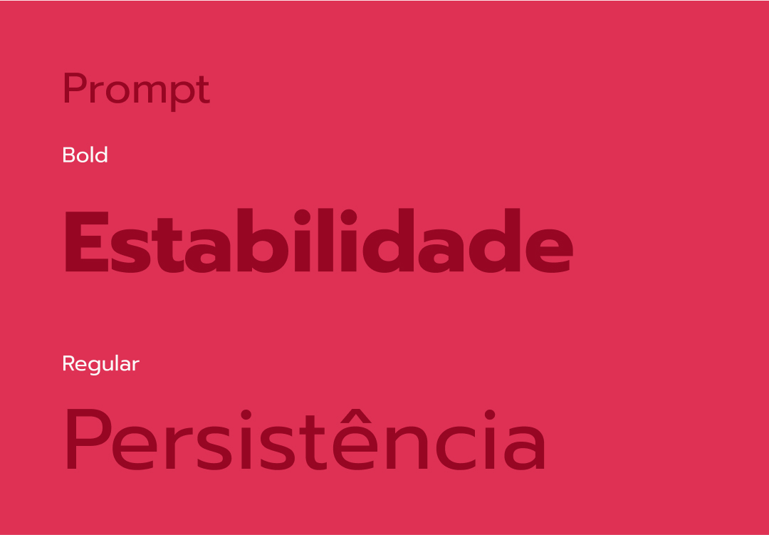
The Prompt font was chosen because it has impressive spacing and well-defined curves, resulting in a strong and striking appearance, and also offers good readability for short texts.
Testimony
It was "redundantly great"! I am extremely satisfied. I hope your work reaches an even wider audience to help more and more people. Thank you!