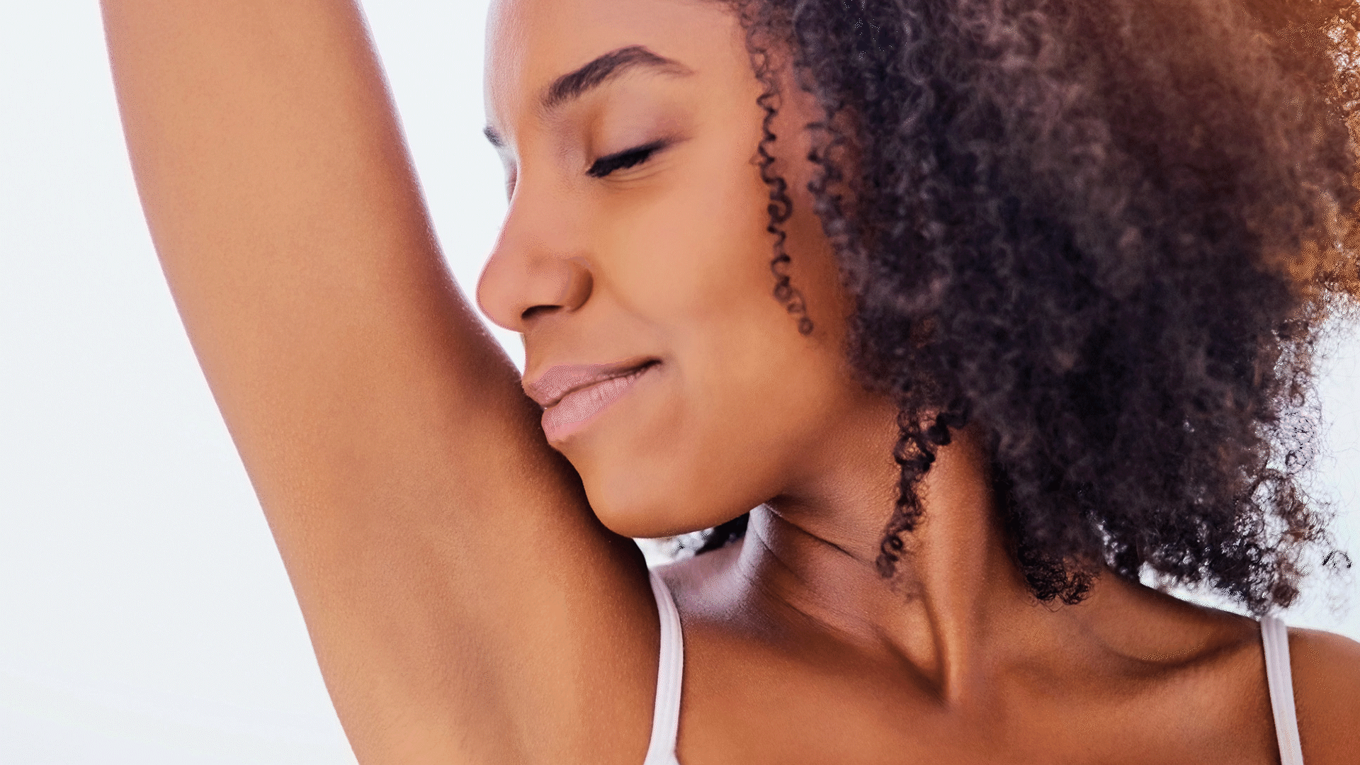
Kelly is a friend who took advantage of the pandemic to pursue a profession she'd been passionate about; hair removal presents some specific challenges within the aesthetics sector in the region where she works.
service
Visual identity
year
2020
sector
Hair removal, aesthetics, beauty.
Concept
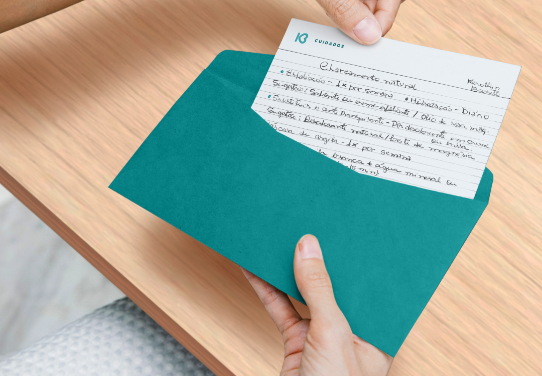
The visual identity in the sector all sought excessively feminine icons (flowers and the like). Kelly was more interested in being known for her professionalism. The symbol was conceived from her dedication to fighting for women's well-being and self-care.
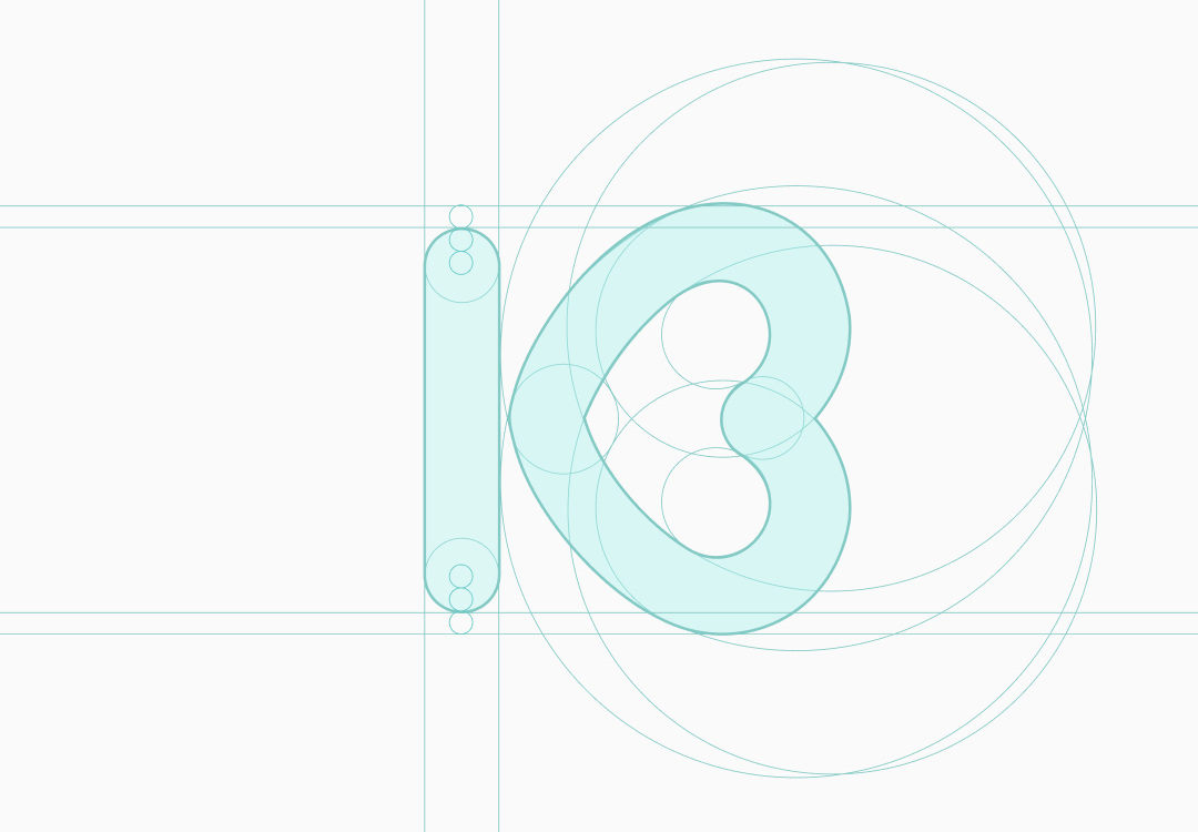
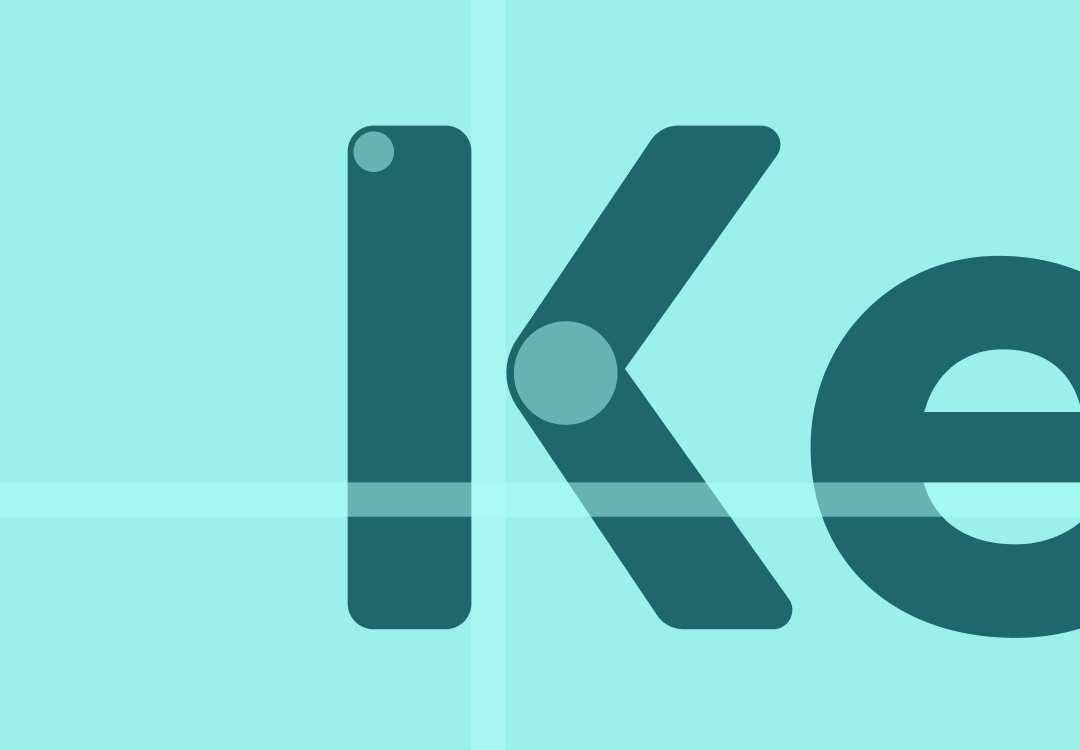
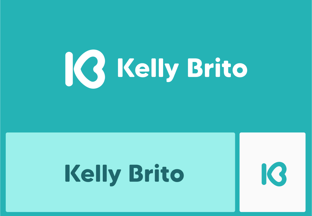
Signature
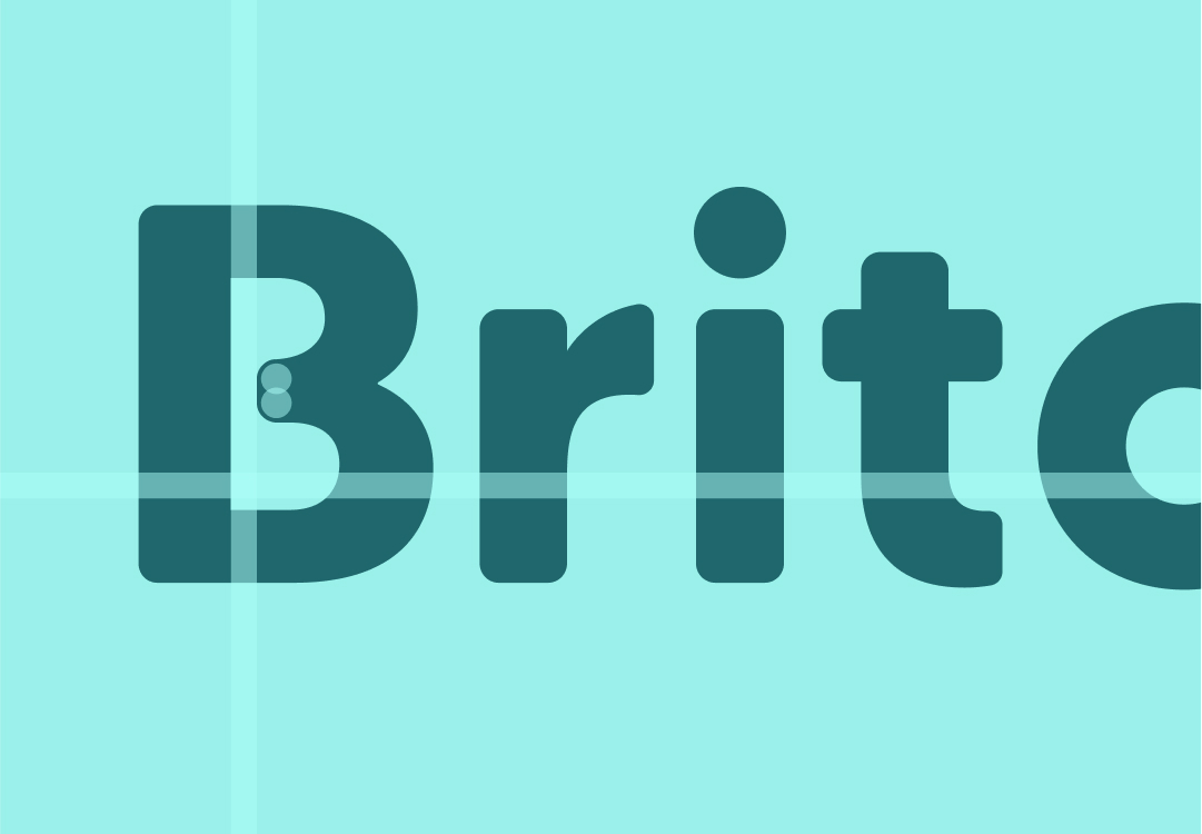
She didn't want to create a studio name. Her own name was enough. The difference would lie in the positioning during the service. The distance between the tower of the K-shaped arm and the bridge of the B-shaped arm alludes to the removal of the strip during the epilation process. The rounded shapes convey the smoothness the skin feels after the procedure.
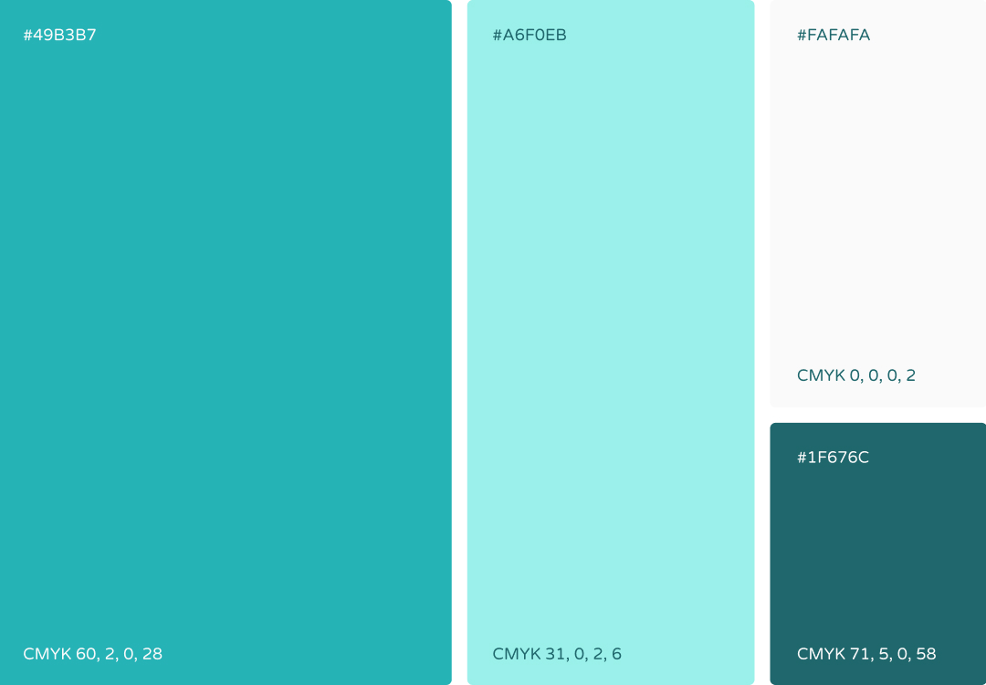
Colors and versions
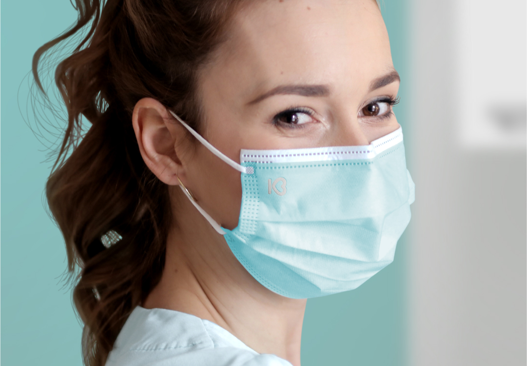
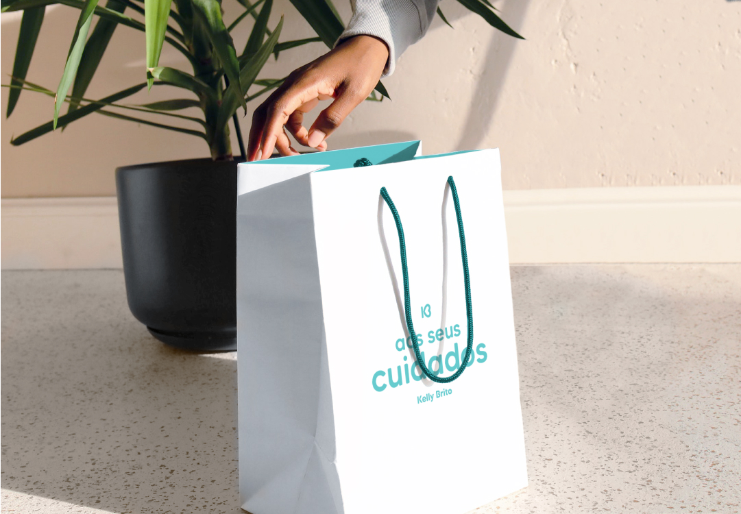
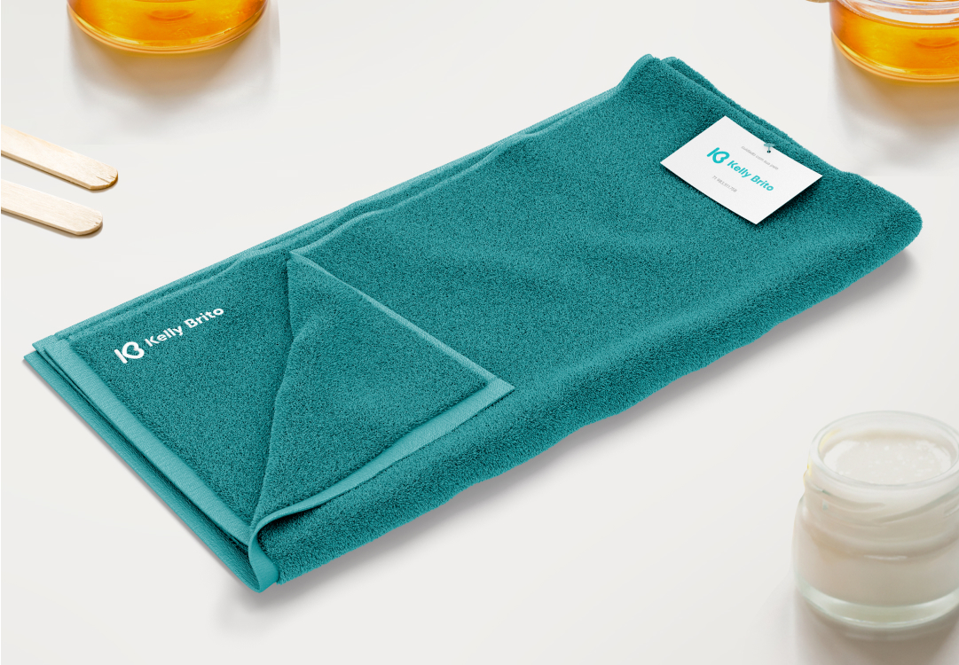
Kelly's service was always exceptional, avoiding the common practice of professionals disappearing when appointments are scheduled. In this sense, we wanted to create the impression of an aesthetic clinic, to further differentiate ourselves from the competition. Generally, the sector favors stereotypical feminine colors like "pink." So we opted for cyan green/blue.
Testimony
The word that defines it is authenticity! I've never seen such authentic work before; it's not just a logo or a visual identity, like many others we see around. Lucas manages to convey the essence of his brand through details that make all the difference and enrich the work, something with purpose and intention. I'm a fan ☺