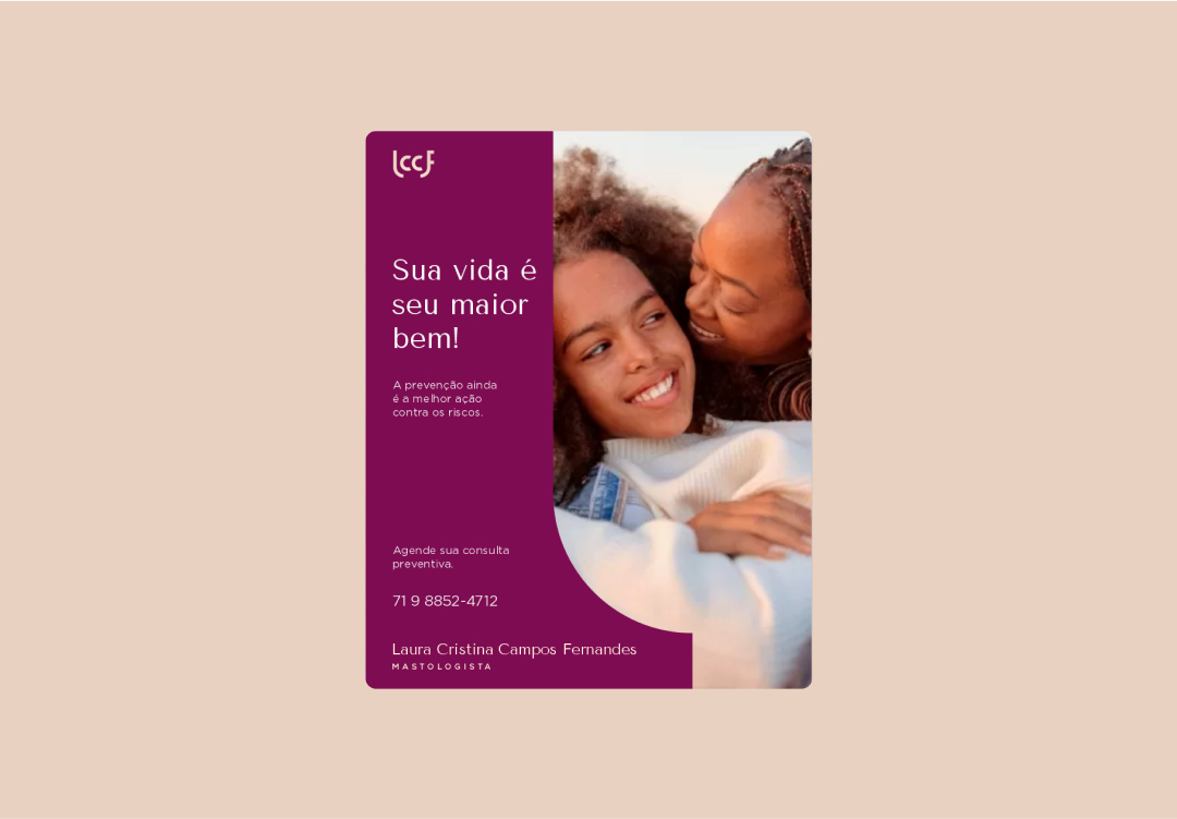
To convey the professional's competence to patients, clinics, and companies through maturity, simplicity, and visual elegance.
service
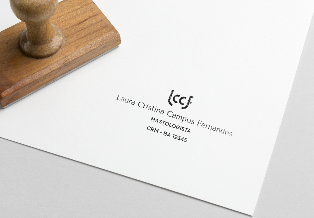
Logo, visual identity
year
2020
sector
Mastology, health, prevention
The idea
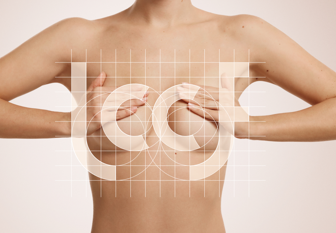
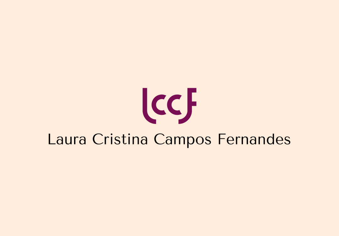
The professional, whose specialty is the study of breasts, needed to represent her identity in her logo.
Breasts have a circular shape, so it wasn't difficult to see that Cristina Campos's CC could represent them. But the beauty lay in the silhouette and sobriety of the forms, showcasing Laura's professionalism.
Colors and typography
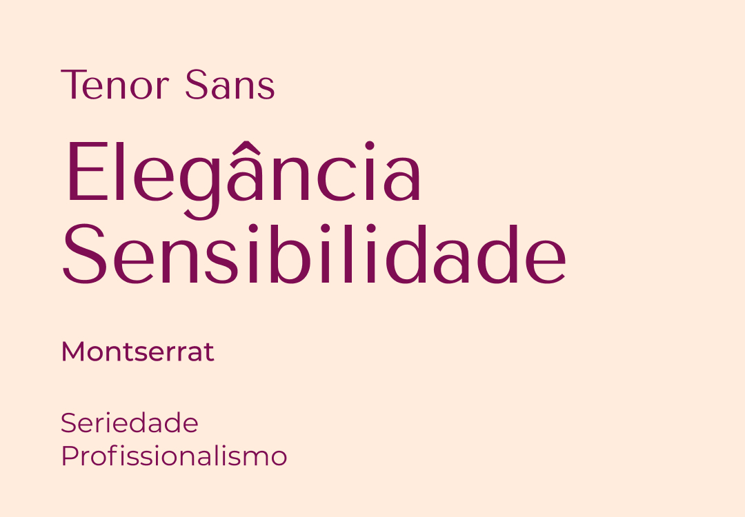
The font chosen for the title was Tenor Sans, due to its delicate forms, representing femininity and easily connecting with the main audience.
For use as a support source for Montserrat and Medium, for longer texts and ease of reading.
Testimony
Lucas, you understood the information I gave you very well, and the result was excellent, far exceeding my expectations. I really liked the final result, and this will be the first of many projects to come. Thank you very much.