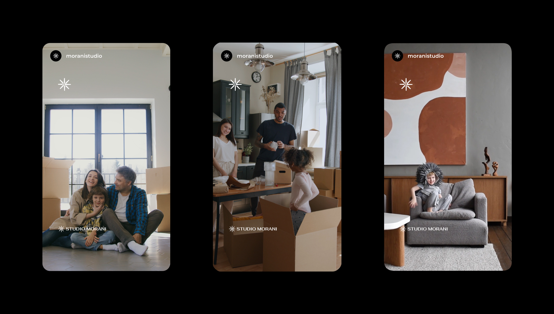
A bold, long-established company in the architecture and interior design sector in Salvador and its metropolitan area, dedicated to construction projects, renovation services, and online consulting.
Offering a humanized service, taking into account all the client's needs, caring for well-being, quality of life, and integration with nature, while also valuing aesthetics.
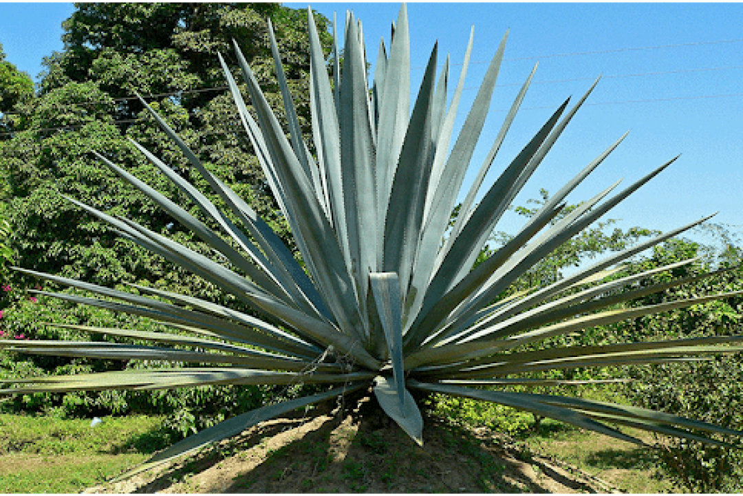
The name of this studio is inspired by one of the variants of the agave plant, which has been used in projects since my college days.
service
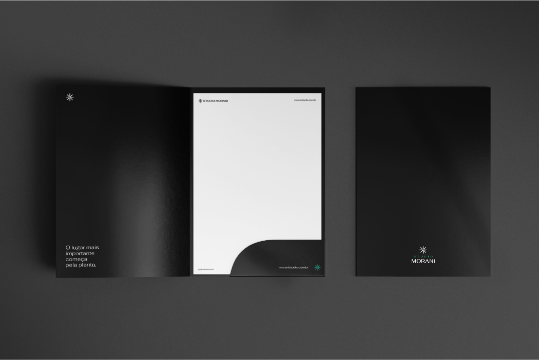
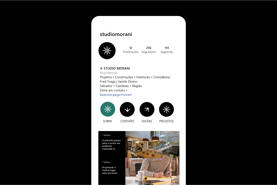
Visual identity, slogan
year
2020
sector
Architecture, interiors, renovation.
before
after
Naming
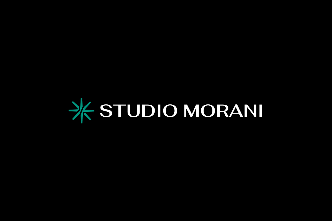
Fred and Jamile came to me with the name AGGAHarchitecture Because they have a connection to the agave plant and wanted to bring that into the project. And they thought of using that spelling. But, in conversation, we came to understand that communication with that name would be complicated, so in a research exercise we agreed that Morani would be a good name and represented it well.
With a bonus of morani Having a familiar sound, like living in a dwelling. One of the duo's cherished aspects.
Concept
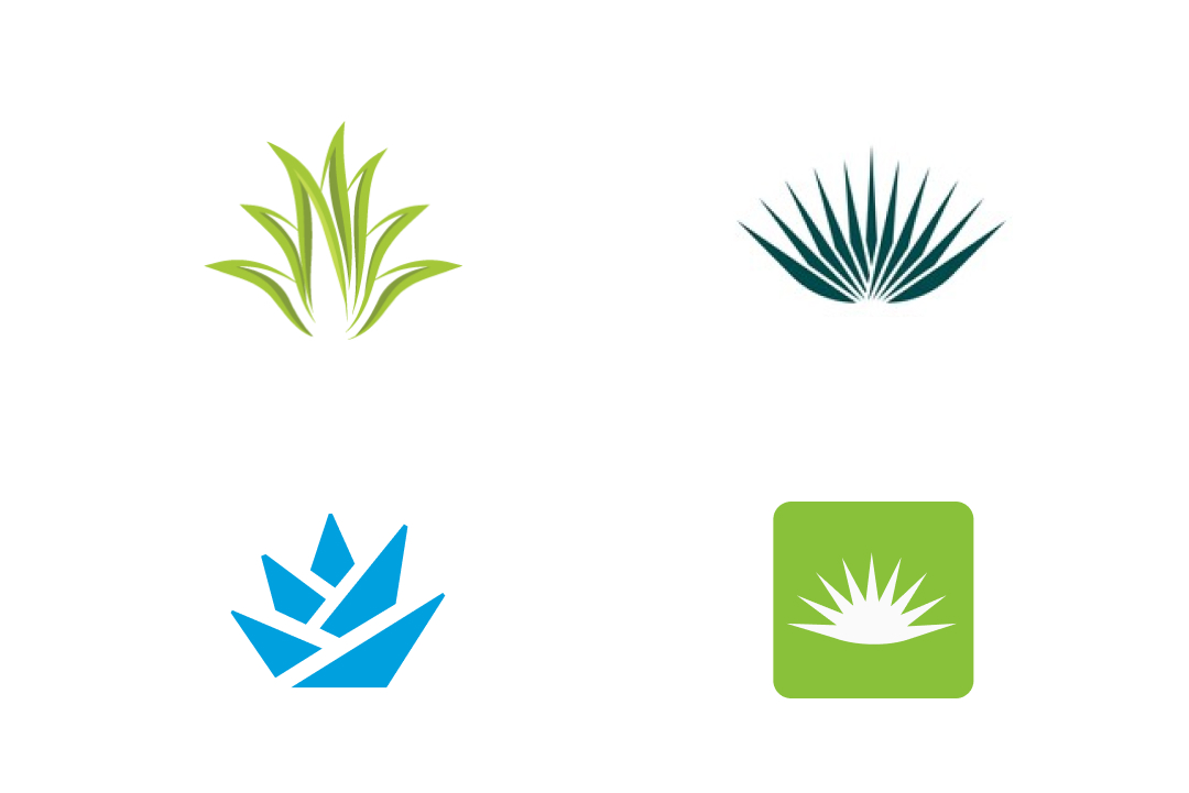
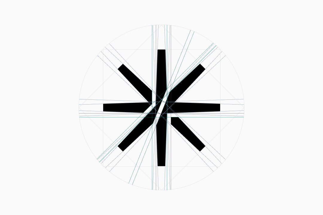
Since college, the duo has developed a fondness for incorporating the agave plant into their projects. Because its symbolic importance is quite evident in a search for logos featuring the plant's name, I noticed that all the designs were represented in a similar way.
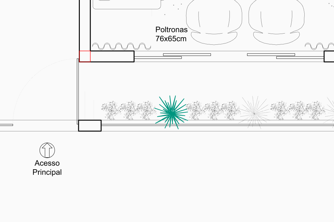
So I used their project sketch with the floor plan as a base and designed a logo from a top-down perspective, which is basically how everything starts.
I found in it a way to highlight the pair by cutting the symbol so that their initials, J and F, would be present.
slogan
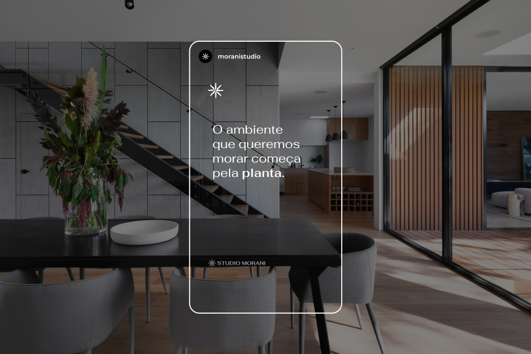
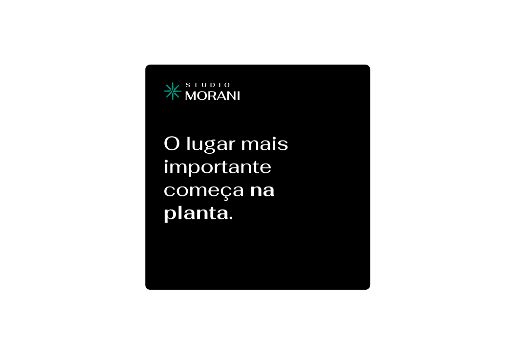
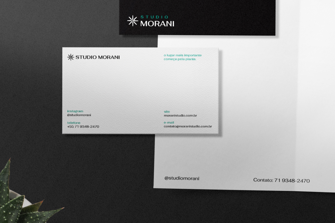
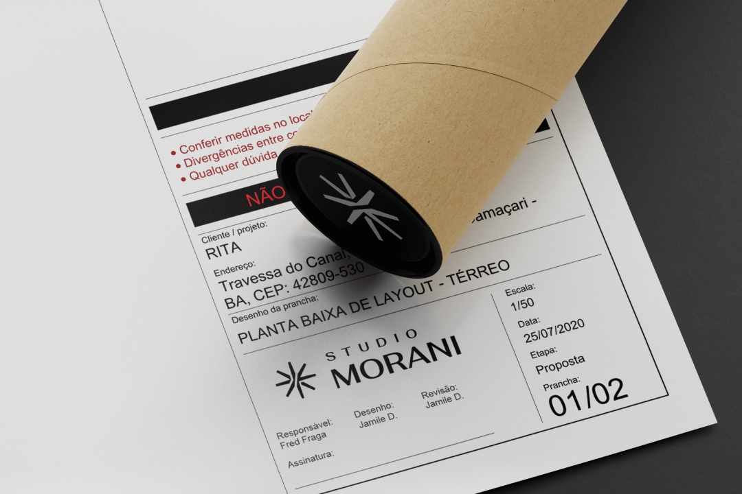
The most important place starts with the plant. (a brazilian way of say: blueprint)
variation The environment we want to live in starts with the floor plan.
The phrase that inspires these professionals is the idea of building from scratch. In Brazil, we have the language of blueprint design. Morani is a kind of blueprint; clients who want a beautiful space can be sure that this is carried over from the foundation, from the blueprint stage.
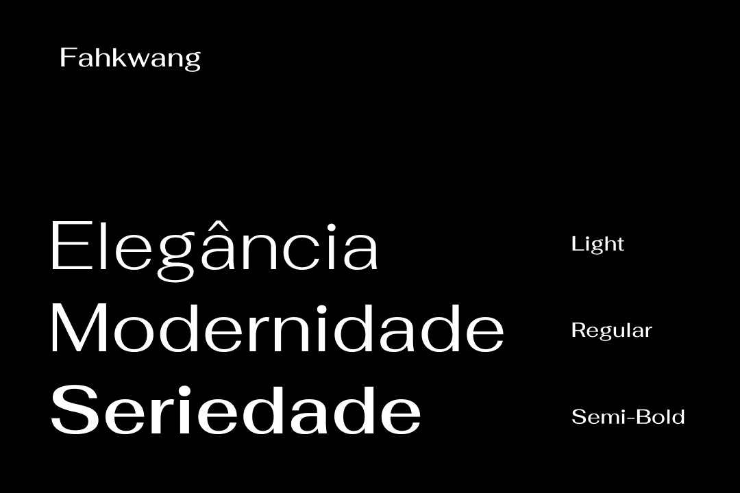
Typography
A typeface was needed that matched the sophistication of the symbol. Therefore, I sought out Fahkwang, which offers various weights to convey both elegance in the writing, the modernity of the designs, and the seriousness of the professionals.
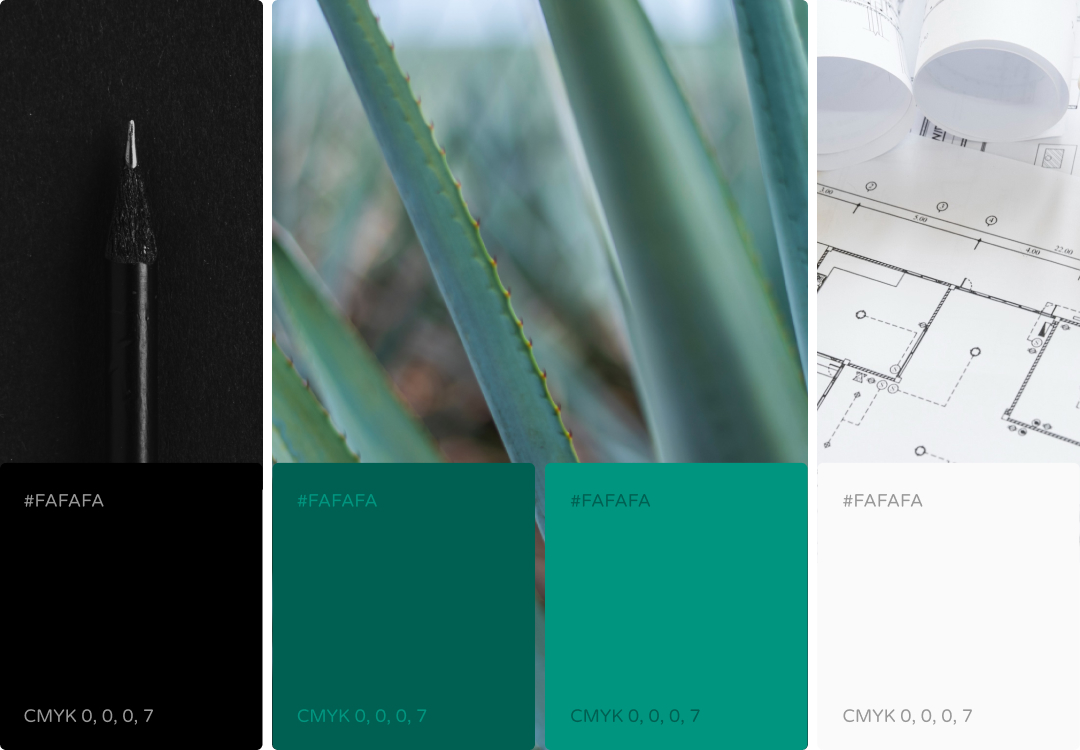
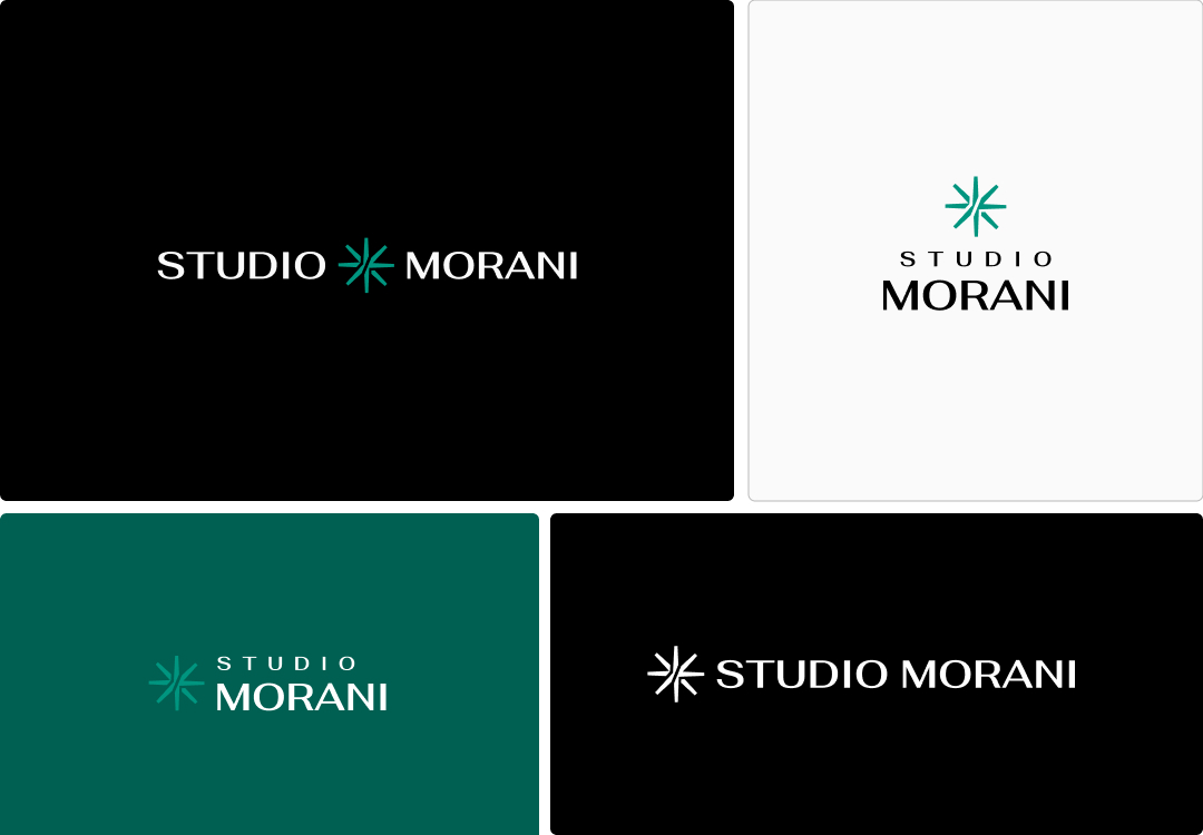
Colors and versions
Regarding the colors, we have the brand's principles, starting from the initial idea sketches, moving through the company's essence, and going to the project blueprint. We have options for this signature by positioning and resizing its elements, making it adaptable to various media orientations.
Testimony
Our brand is exactly as it needed to be. We have a visual identity that rivals the top architects in today's market, and I am very grateful for the service provided. I look forward to using all of our material with our clients; I've already recommended you to several people, and I will continue to do so because your work is fantastic. Thank you very much!