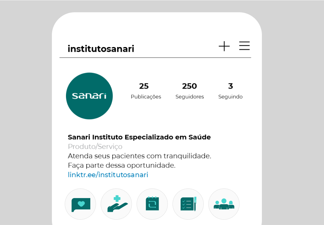
Everyone likes to work in an environment that fosters their best performance. This is no different in the healthcare field, and Sanari was created to serve professionals who want to work in a dedicated space so they can better offer integrated services across other areas of healthcare. Serving society by providing access to areas that are difficult to reach through health insurance plans.
service
Visual identity
year
2022
sector
Health, self-care, prevention
Concept
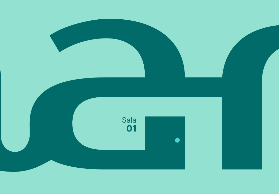
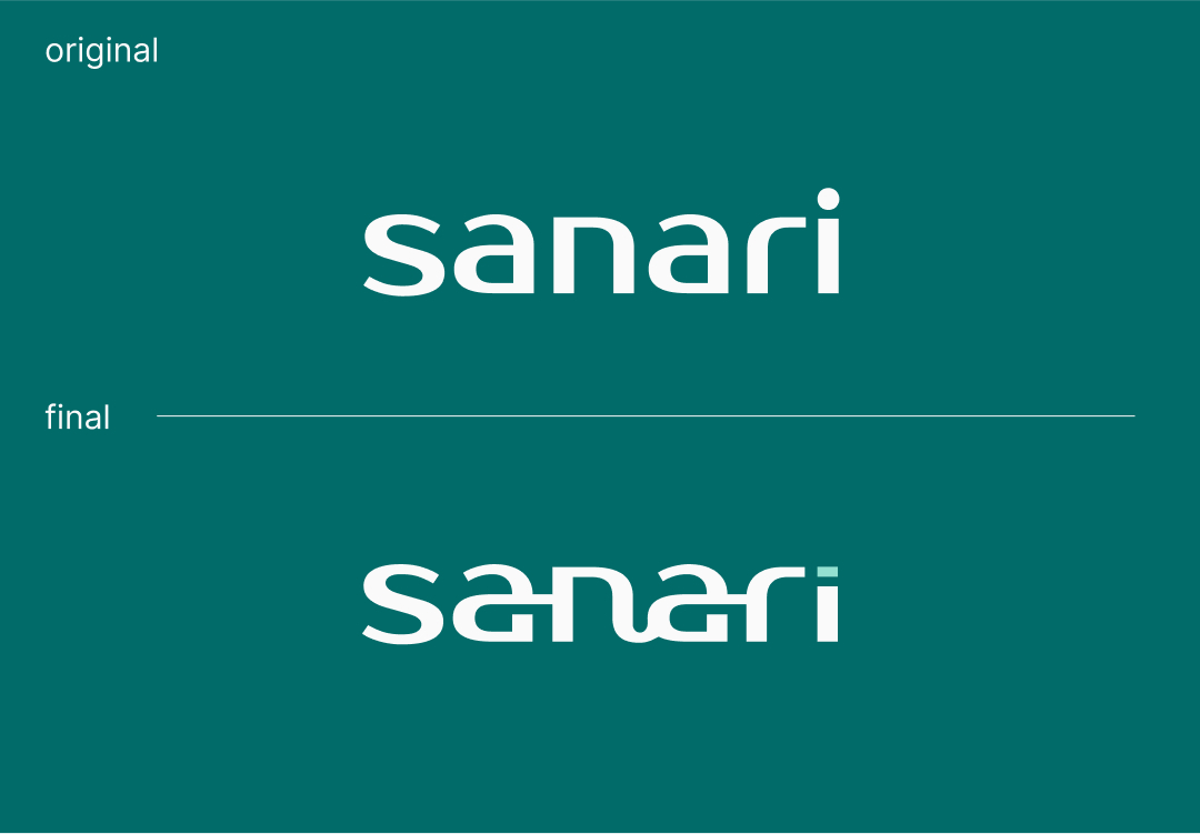
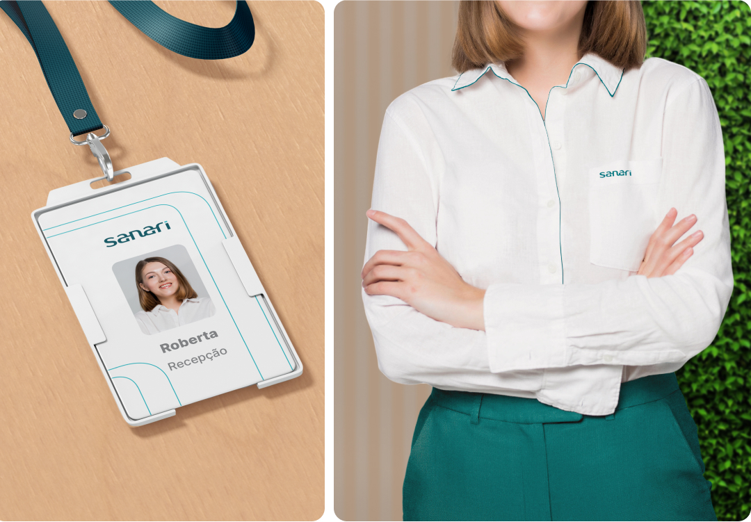
This is a space with rooms for a collaborative workspace for healthcare professionals. Being a coworking space, they will have common areas. access. I used a font with modern features representing one of the requested concepts, making adjustments to subtly convey the concept of interconnected rooms in the negative space of the letters. a in Sanari. I like the connection of n with the a, because it illustrates handwritten strokes.
Colors and typography
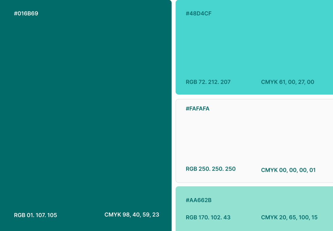
The colors used in the sector are inspired by the red cross and the corporate blue. In the concept of humanizing customer service, related to Sanari's personalized approach, I sought inspiration for these colors in nature.
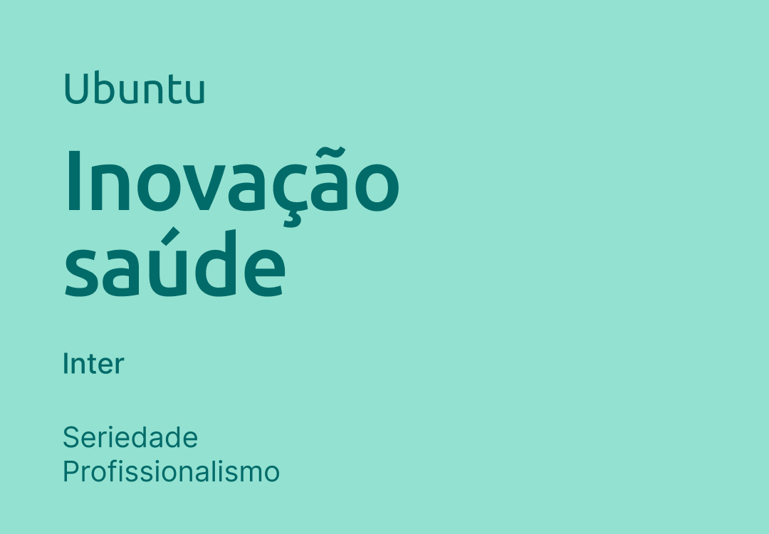
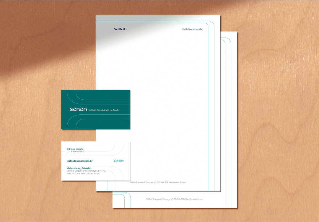
The initial font was Inter, which is quite comprehensive. However, there was a need to add a typeface with more personality related to innovation, and Ubuntu shone through. It was a welcome addition to the project, bringing another layer to the institute's proposal.
For us at the Sanari Institute, it was a great experience working with Lucas Fox, because in addition to being a very talented artist, he managed to capture the essence of our business, our concept and feeling, and convert it into a brand.